Museo madre
madre in Naples has a world class contemporary art collection that is on permanent display & a set of temporary gallery spaces, which when I visited was showing an outstanding retrospective of work by Kazuko Miyamoto, curated by Eva Fabbris.
Permanent collection
madre’s own collection begins before you even buy a ticket for entry. The door from the street through to the entrance hall is an immediate welcome to a contemporary space. Daniel Buren’s ‘Axer / Désaxer. Lavoro in situ, 2015, Madre, Napoli – #2 (dettaglio)’ is a bold, bright, reflective, architectural work that fills the entire space from the street to the staircase to the gallery floors. The walls are a glossy red with architectural detail in yellow & blue. A section of reflective walls paired with black & white striped flooring seemingly bisect the space creating the illusion of architectural height & depth off the main vestibule. It is a great initial experience of the galley & promotes a feeling of discovery as you need to figure out which space is real & how you find your way to the first floor for the galleries.
Once up the stairs the gallery spaces open out into a more traditional white wall spaces where each room is occupied by one artists.
Francesco Clemente’s work comprises frescos & tile works that fill the entire space with colour, pattern & story. A contrast to Richard Long’s space where his signature theme of the natural world is present by way of the top part of the space being expressively covered in mud marks that look to be made by the motion of its application. The gestures look frantic & full of energy, a feeling heightened by the drops & splashes on the white wall below. This work, which is called ‘Line of Chance’ lets us think about a primal connection between humans & the earth. With the work being applied to the very top part of the space we are forced to look up to experience the expressions in the once wet material, only being able to study closely the fall out that has splashed below.
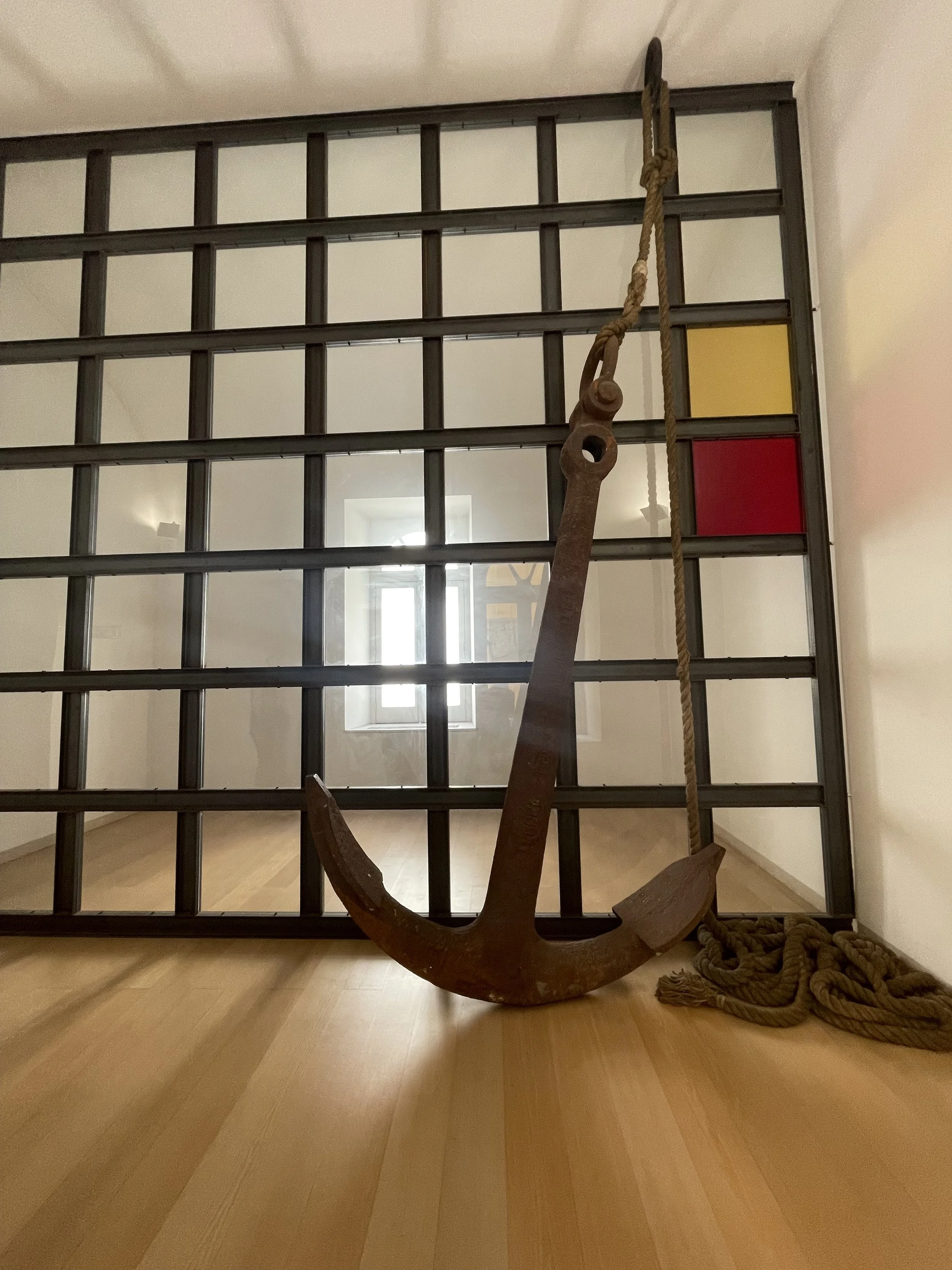
With Jannis Kounellis’ work we are confronted with a space divided. The window beyond the work illuminates the space through a room sized metal grid with clear & coloured panes. On the accessible side there is an anchor & pile of rope. The anchor is probably of a normal size next to a large sea vessel, but in this space next to a human, the scale is huge. Deep meaning of this work evades me, what does strike is the scale, weight & light of the few objects.
Moving through the galleries you eventually come across a non reflective black rectangle on the gallery floor. Standing at the barrier seperating the work from the viewer & peering over there is no indication of what the work actually is. Having seen Anish Kapoor’s work before in a large retrospective my thoughts went to thinking it was made of powdered pigment. Then, in a tense moment in the gallery the person next to me threw a coin at the work after being encouraged by a friend. Absolutely expecting the coin to hit the powder & make a little black poof in the air, it was thrilling to witness it disappear into the black void & make a sound as is hit the bottom. The works is actually a perfectly sculpted hole in the floor painted in Kapoor’s famous blackest black. With so much debate around Kapoor’s practice & some of the scandals attached to his name, when seeing this work it’s hard not to be in total awe of the majestic simplicity of it all.
After touring the first floor with the permanent collection it was time to head up to the next floor to see the special exhibition of work by Kazuko Miyamoto.
I entered the space having only heard of Miyamoto while researching this visit. With hindsight, this has surprised me. Her work is masterful, simple, powerful & the exhibition introduces her practice in a rough chronology. Starting with maquettes, drawings, photographs & small/medium string works. Slowly the exhibition progresses into larger, more complicated works that eventually refine & harness the power of pure excellence.
The string works have been painstakingly reconstructed in the space by the gallery installation team, a job that must have required amazing concentration & perseverance. Many of the large works are tacked to the wall & floor forming architectural shapes stretched through the space. Each individual line pulled straight between its 2 anchor points, en masse this creates a curved effect that seems to have motion as you move around it.
These still yet kinetic works promote a wonderful dance in the space as viewers move in all manor or ways to see the work. Some works are in contrasting blacks & reds others are in muted blondes & tans.
Further through the spaces there are rope kimonos hanging in traditional ways & complicated scribble like line drawings on the walls. The journey through the exhibition takes us from complicated gallery display theory that suggests the wall & plinth but in a skewed way. To strongly associated traditional cultural objects & materials, used & formed by a Japanese female body from the 1970’s to present day. The latter possibly highlighting why I’d never learned about this work in my 7 plus years of formal art education.
Once through the exhibition galleries it’s possible to ascend to the top of the building onto the roof terrace. From here there are scorching panoramic views of Naples with Mt Vesuvius ever present on the landscape. There are several permanent works up there but the view steals the show. Also rather neatly I think it has become a photo tagging spot that the galley can boast on their social channels.


