I N S T A L L
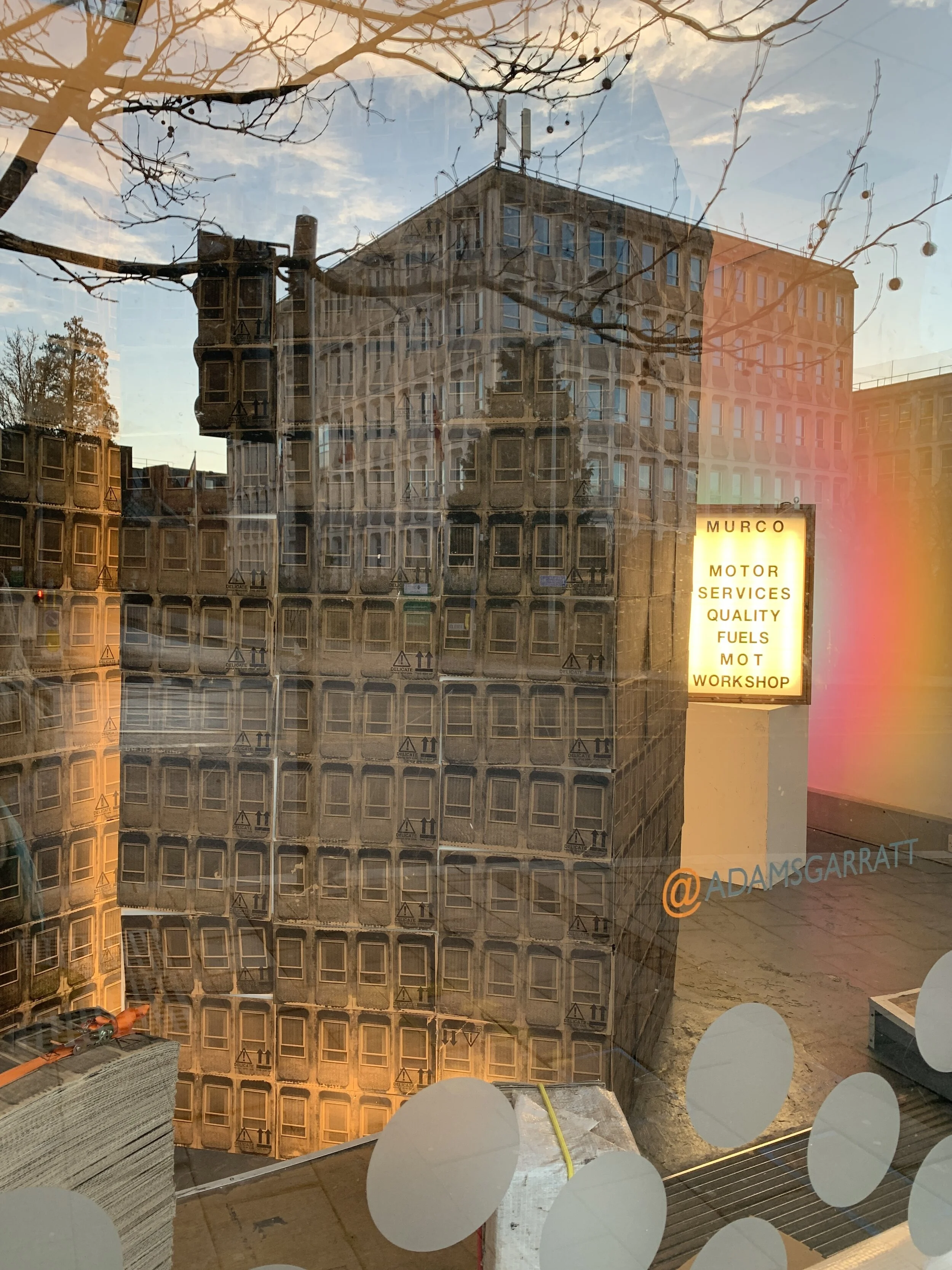
This is the current installation at the Awesome Art Space. It contains reworked version of a few projects & intertwines my (studio) art practice with years of retail based visual merchandising & window dressing. This work is geared towards being viewed from outside of the space & is made in a way that creates a scene that only goes back a few metres.
Dressing a window or empty retail unit is well practiced in contemporary art with some of my favourite artists such as Jeanne-Claude & Christo among them. It appeals in a few ways that add an exciting challenge to my spatial practice.
Firstly, this project has given me access to a space that I don’t normally have, so being able to spread out & work with my materials is a welcome occasion. There is also the challenge of making something that is viewed through a limited frame. The work needs to be experienced from the street, through the windows, adding a challenge of constructing a three dimensional work that can only be viewed from a two dimensional plain. Scale & perspective play an important role in this. Additionally there is a task that involves catching the eye of passers by. One of the benefits of this location doubles up as its downfall. Shop fronts get many people passing by therefore potentially a large audience over time, however we are so used to shop fronts & window displays that we don’t really notice them. Perhaps the main audience to this space are those who know it is a frequently changing creative space or those who set out to seek something that does change. By making a large work that comes in a few parts I was able to fill the space & make it a dynamic work. Hopefully catching the attention of some, but ultimately happy for the work to sit quietly in the windowscape. There are 4 elements to help with this.
To the right of the space is a suspended print work on plastic Monarflex sheeting. This work hangs close to the glass from top to bottom. The image is of a rundown shopping precinct facade in Coventry. It shows the architectural decay of a working class area, damage to the concrete & a CCTV camera in a protective cage. The architecture is printed in the front facing side in black. On the reverse, fluorescent orange sections highlight the detail. This plastic sheeting is translucent so at certain times other light passes through it giving an ephemeral effect to the print.
In the left side of the space are 2 large architectural forms made from images cut from previously printed cardboard boxes. The smaller form flanks the larger to the left & behind. Together they are a simile of the Civic building that sits across the street from the window. The printed image is of the Civic Centre’s concrete windows & was made in a way that mirrors the making process of the building. The forms create a visual barrier to the rest of the empty unit, making the work the only elements that can be seen within the space. These architectural forms are lit from behind, enhancing their presence in the window.
Further back in the space to the right of the cardboard forms is a light box work with a quote taken from a fuel station & car garage. This work adds depth to the space & is revealed to the viewer as they walk along the street. This work is on a timer that illuminates just before dawn for a few hours & just before dusk for a few more hours. The quote is a nod to Ed Ruscha’s ‘Standard’ fuel station print. The quote serves as a written image of a fuel station & the halo of colour surrounding the light box has the same sunset feel as the famous print.
At the very front of the space between the glass & the cardboard print forms are some bound & wrapped prints. These are slightly hidden from view by the graphics in the window but offer a piece of sculptural detail. The orange ratchet strap reinforces the colour in the Monarflex print & the bound work brings in a maquette version of a building being developed in the landscape.


