Home
I’ve been spending time thinking about space & its relationship with being compact- all in the vein of making art. This theme links my practice, interest in certain architecture & has been informed by several areas of research.
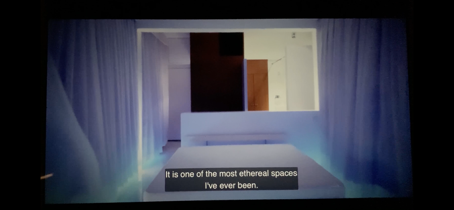
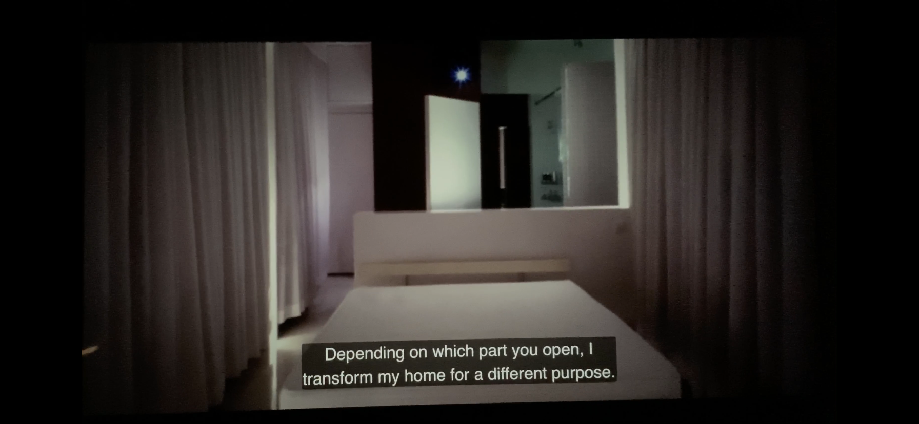
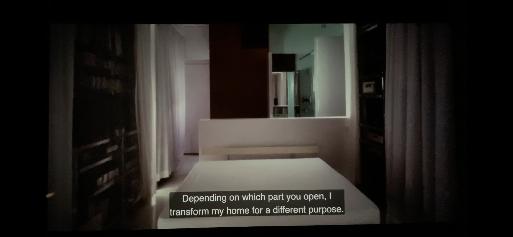
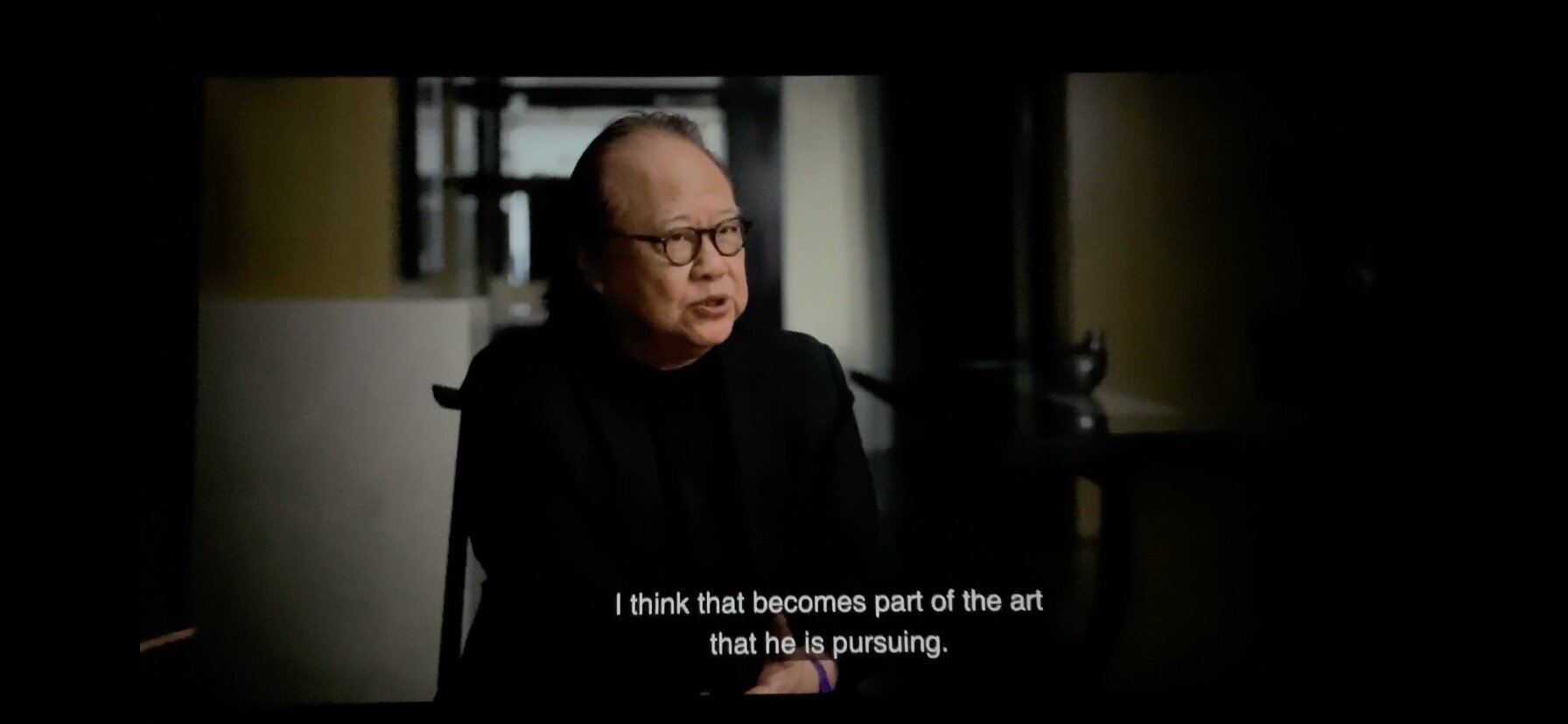
HOME on Apple TV+ is a series that looks at the conception behind & making of extraordinary homes from around the world. Episode 4 focuses on the home of Hong Kong architect Gary Chang, who transformed his 344 square foot apartment into a multi functional, transformable space he calls ‘Domestic Transformer’. Inside his tiny sleek home the space is open & the walls move to create new rooms within the shell. Furniture folds away & disappears, chairs become tables, become walls, become new boundaries. There are many combinations of what this space can be. It is truly an inspired & realistic realisation about what space might need to be as the growing human population crowds into cities. 50% of the world population now live in a city, putting a strain in on the way in which people have to live. High rises are the only answer in many places with people living higher than ever before & in smaller spaces than ever before.
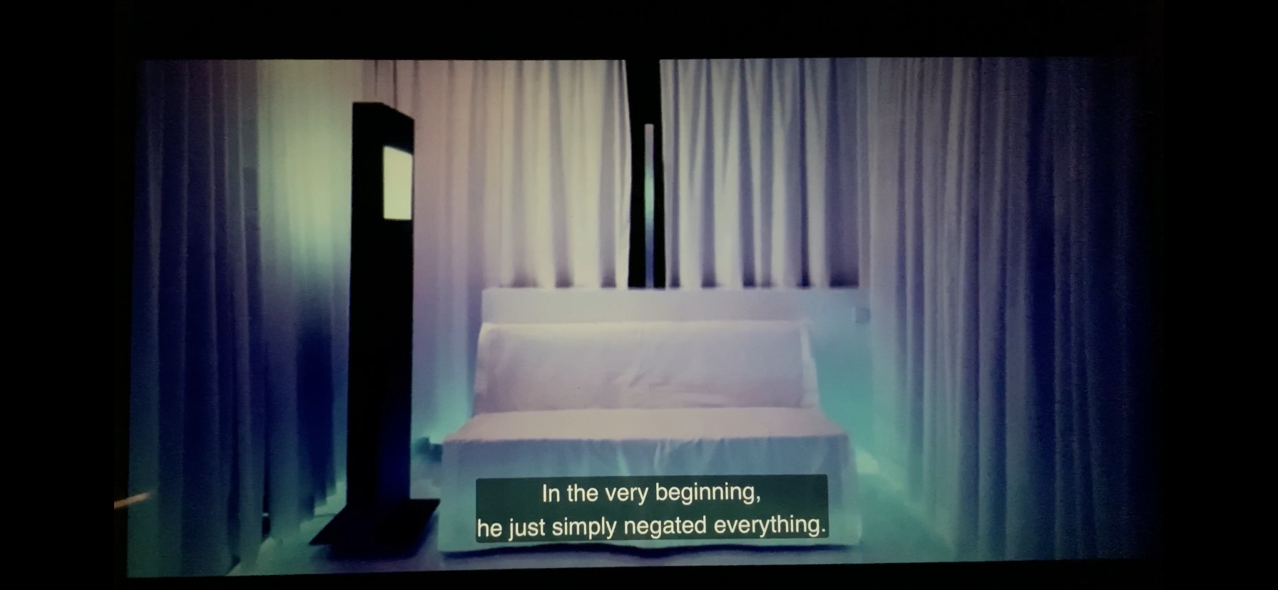
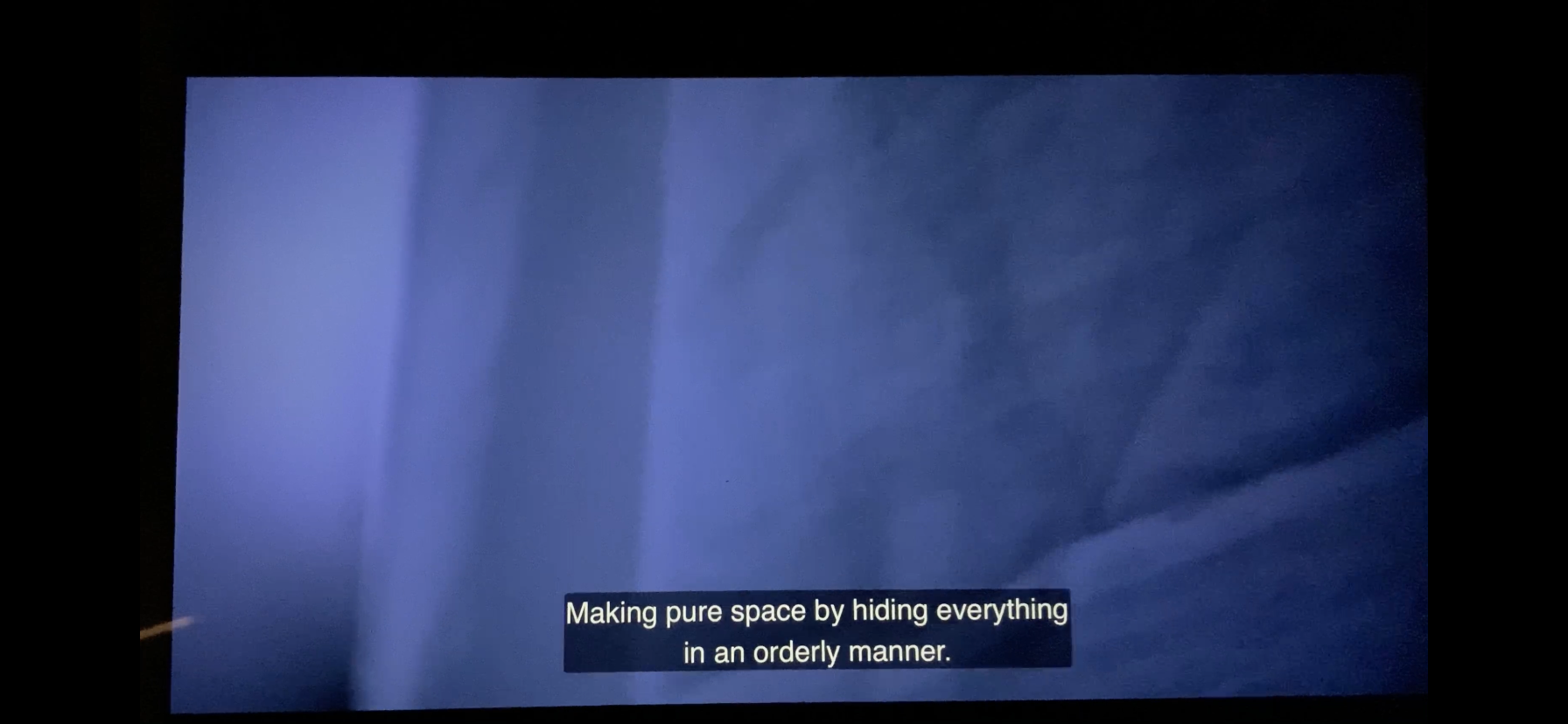
An early iteration of Gary’s home as he experimented with his space is the one that struck me most during the episode. He made the decision to remove all of the tiny rooms that once defined the space, reducing it to a shell. He then used almost the entire edge of the space to make shelving & storage for all of his possessions, finally he used white curtains to patrician the space as he wanted it. This might seem difficult to call special, however in the context of most homes being valued on how many rooms they have, how much space there is & how much stuff is in that space, it became a statement on not taking values from those factors. The form of this home was striped back & simplified for a real world scenario. More specifically in Hong Kong the space was addressing a local reality as buildings down the street, across the road, next door, above & below all have a similar footprint. This apartment starts to answer some questions on how future blocks might be built.
New blocks are being made with compact living spaces in them, so how can the design of the space be incorporated into that. A valuable question for the future of housing, valuable for the future of renovation & valuable for me to consider with my art practice. So many of those values I try to figure out for my own work.
How do I make impactful work about something I care about, taking into consideration the scale of work but with restrictions on making space & storage space. I have been doing ok by reworking things that are taking up room, making new work that can be stored easily, changed or reused. But what is the extra element that I can add to all of these things that makes the work a useful comment on today? Looking at Gary Chang’s home & seeing how he approaches space could be a lesson for me.
I suppose in some ways I’ve always been interested how an inside space looks from the outside. Wondering, what the viewers experience as they look into a space. This can come from a place as simple as looking through windows in the street when passing by or looking across the landscape at a block of flats in the evening when all of the lights are on. These spaces illuminated inside showing tiny details often without really revealing the intimacy of the space within. There are 3 particular moments that have planted this seed for me.
As a young boy I received a toy telescope as a gift. I would use it look out of my bedroom window at the moon & at a block of flats on a hill about a mile away. I loved seeing its silhouette on the skyline & all of the lights inside at night. I was always surprised at the lack of activity there was, perhaps expecting to see people or movement.
On my first ever trip to London as a young teenager I went on an open top bus tour. The glow of the city was striking as we drove around, as the bus moved slowly in the traffic I realised I was at the same height as the office workers on the 1st floors of the buildings we passed. They were busy in their own world working away never looking up to notice anything. I couldn’t understand why they weren’t looking out at all of the action on the street. I was fixated on the orange glow through the tinted glass & all of the people inside.
My current job role & for the past 10 years has been about making a retail space look welcoming from the outside. Dressing windows, creating exciting displays & making sure these visuals deliver when people enter. It is a fairly creative business that uses many of the elements I know as an artist, colour, form, scale & texture. This role has been a great place holder for my own practice in terms of creative expression. This final element has allowed me to develop my work ethic in a semi creative/retail environment along with all of the things work teaches us, such as time management, prioritising tasks, delegation, preparation & planning. These things served me well entering post graduate study in 2016 which I did alongside this job & have fed some of its values into my art practice.
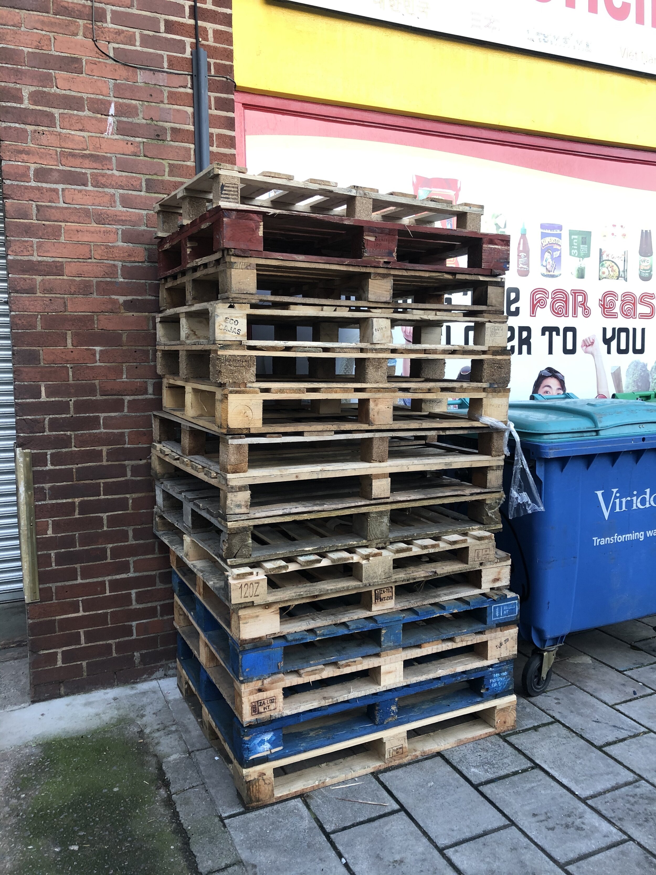
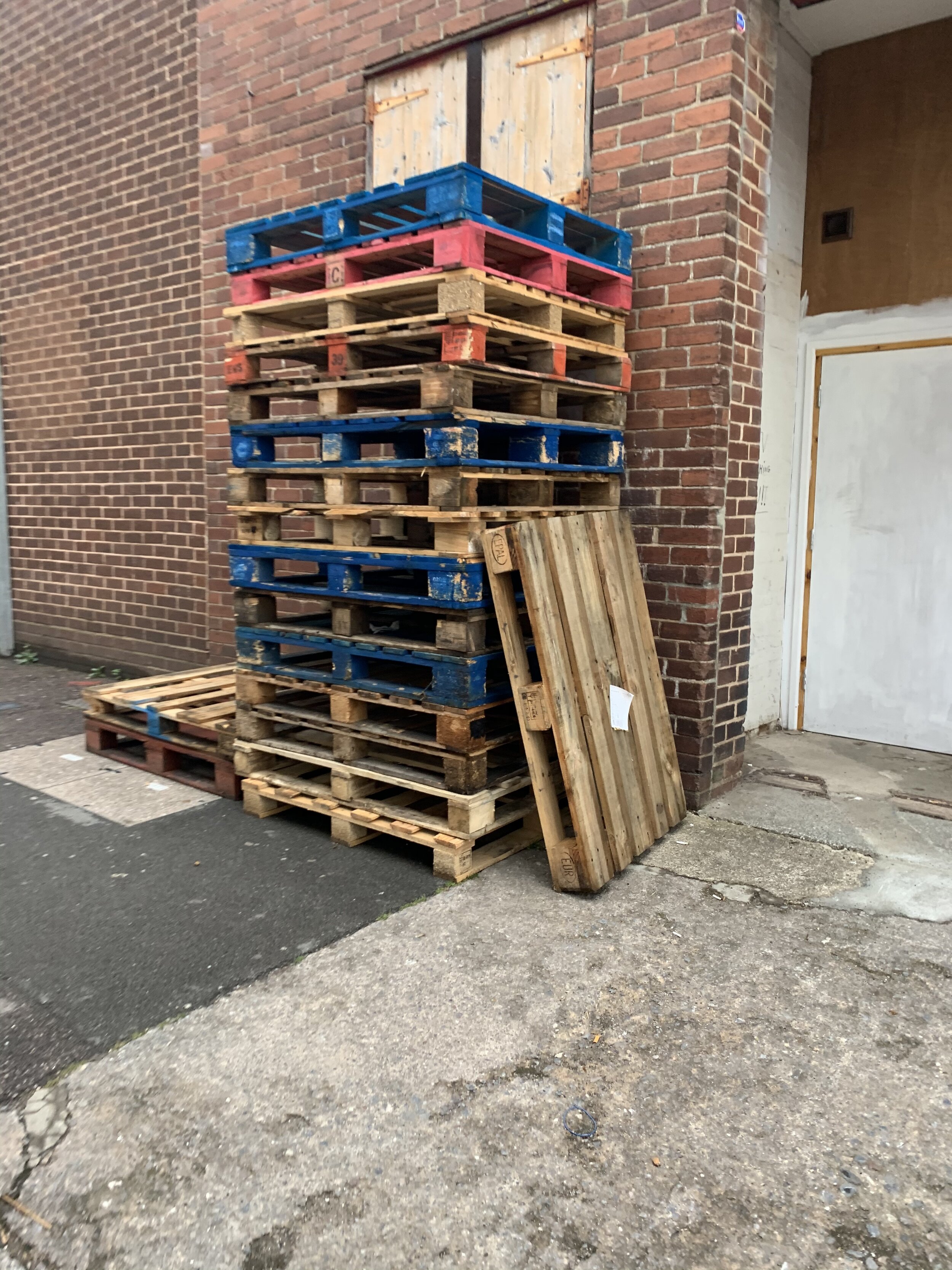
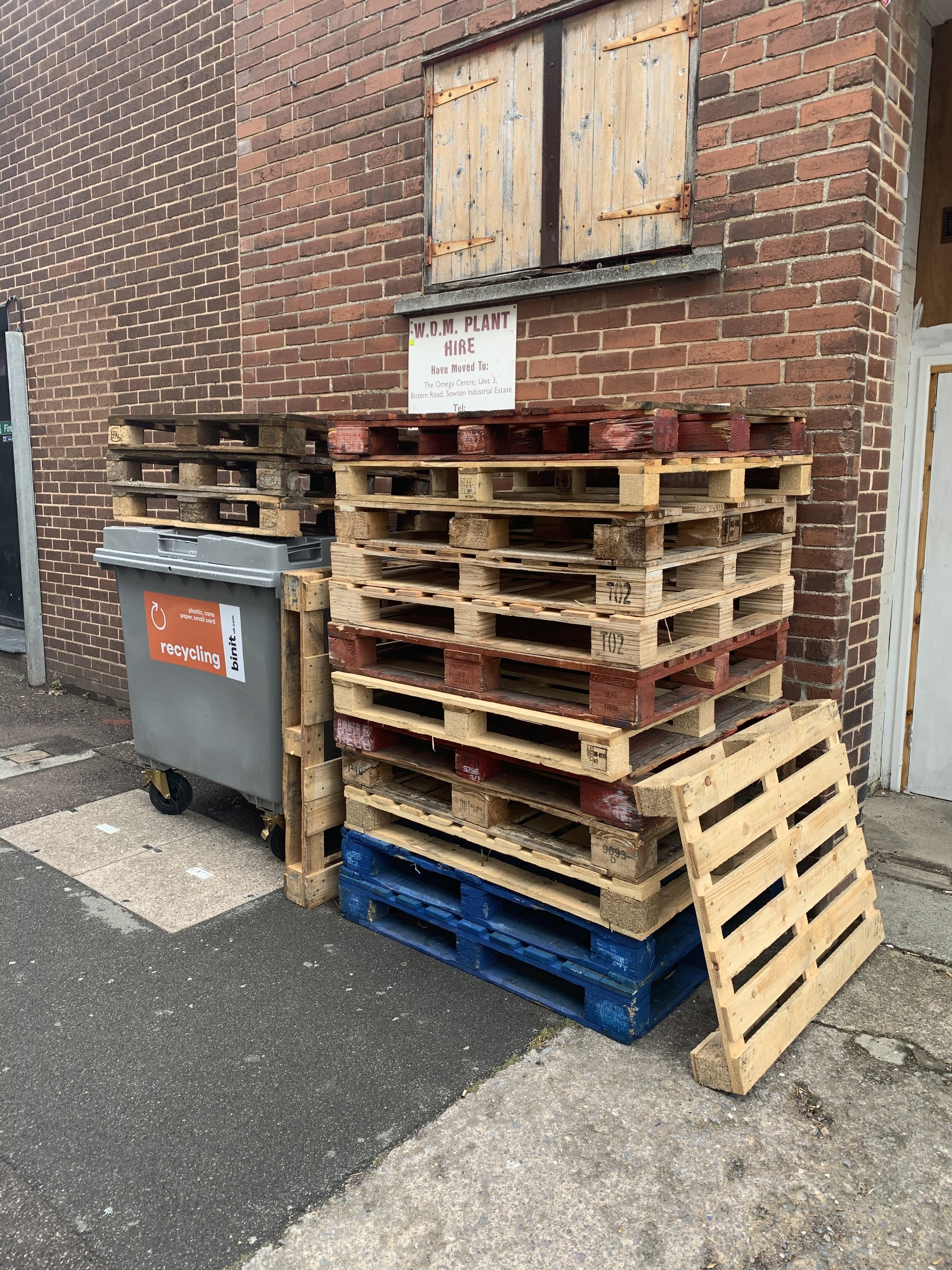
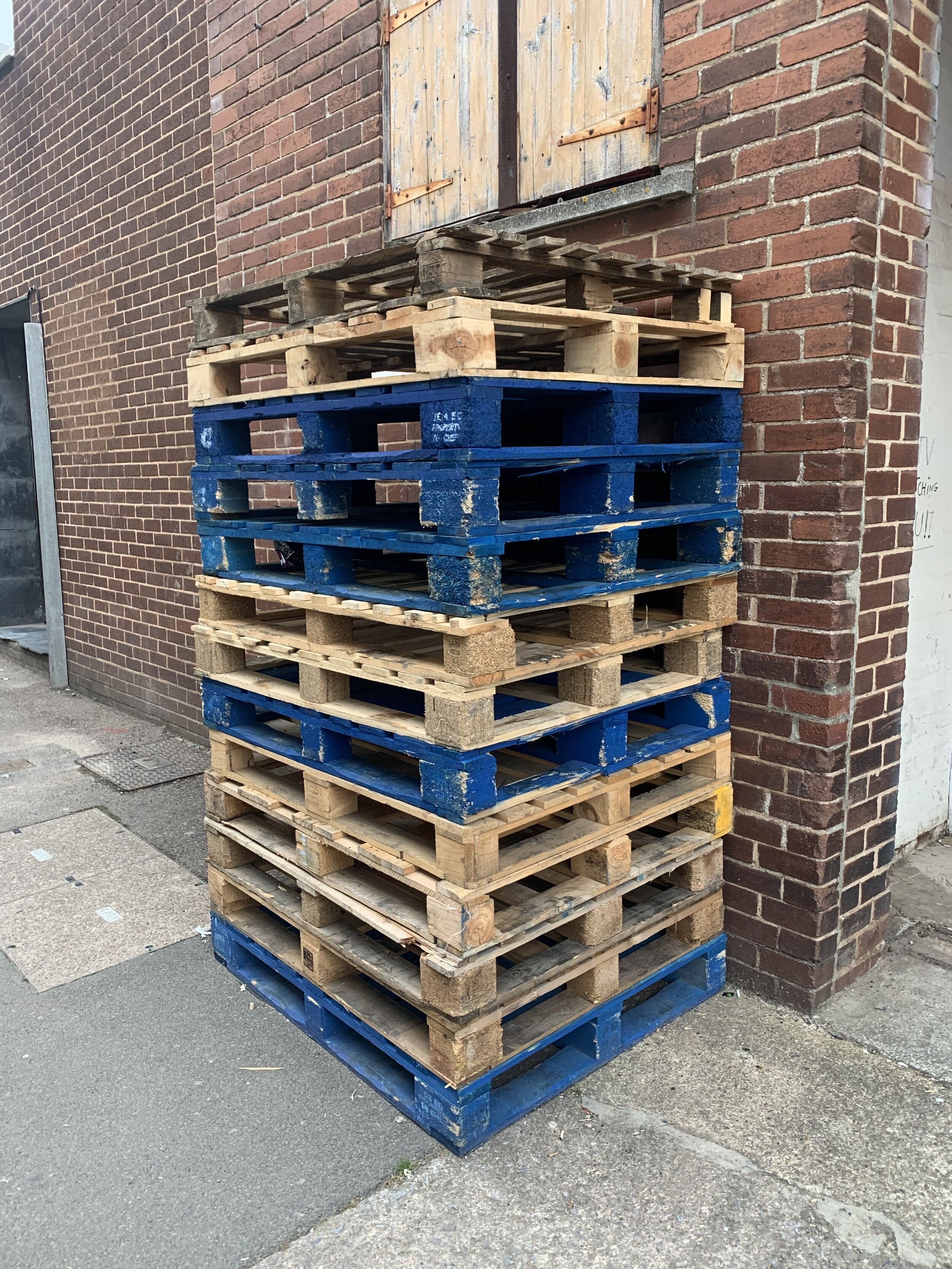
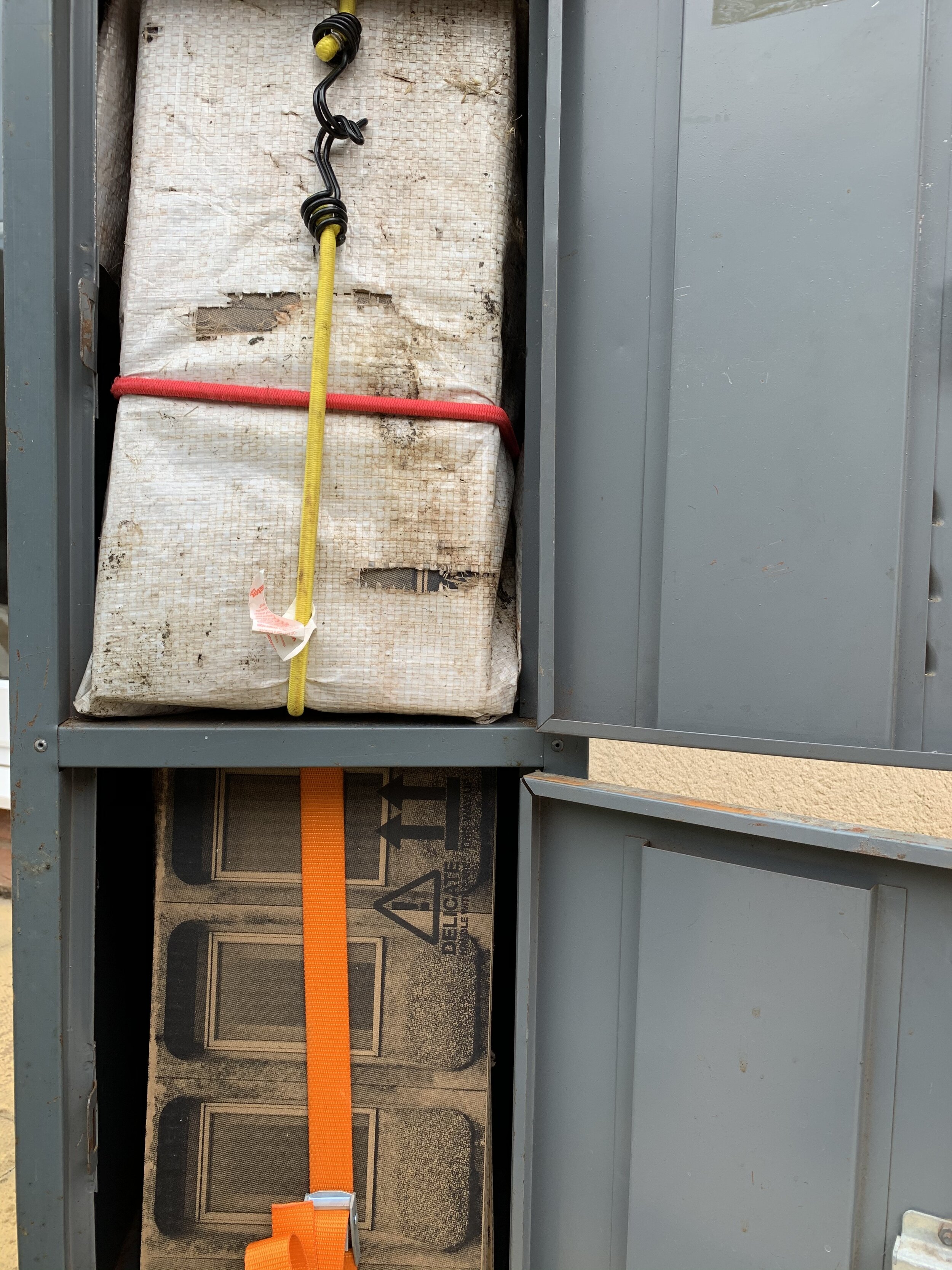
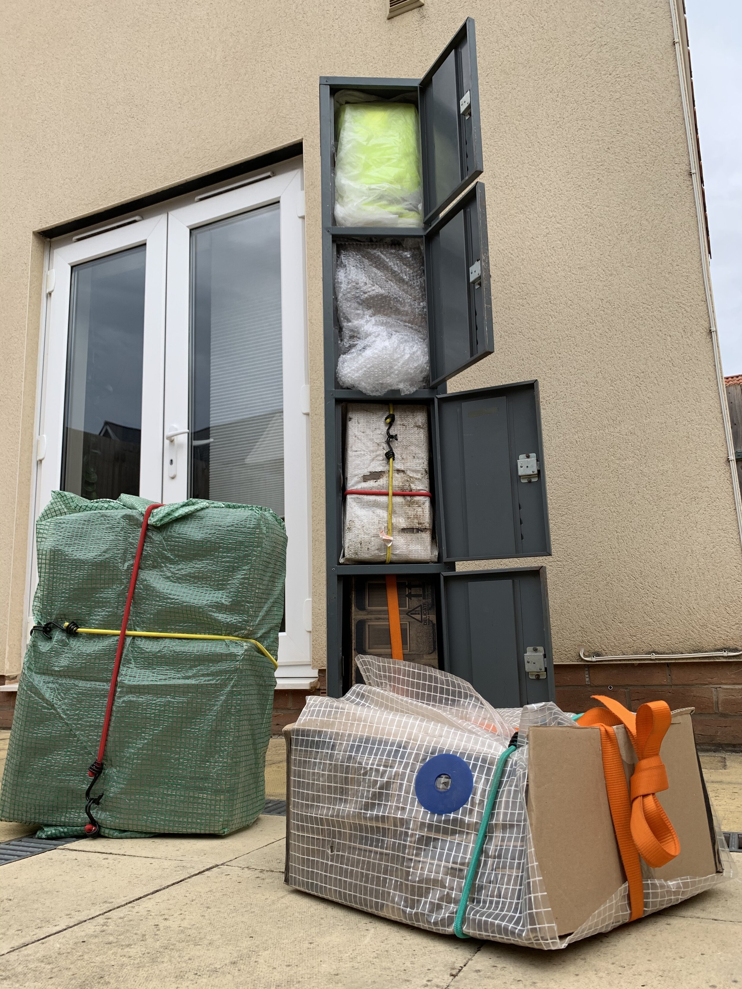
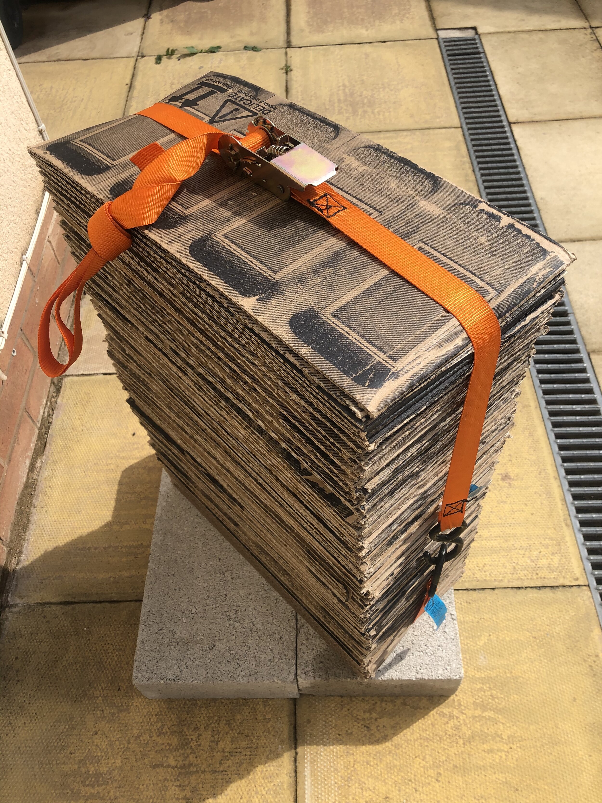
Together these moments have planted seeds at a young age, allowed me to develop an interest & given me time & space to practice an artistic response to this stimulus. I have been able to connect these experiences to a theme of the built environment taking cues from different spaces along the way. Currently I am looking towards making some new work that keeps in line with this but perhaps looks deeper into the spaces that are built for us. Although I have a keen, borderline nosy interest in the spaces we make in our homes, I fear this could become more about the domesticity of spaces on an individual person level rather than the overall form/material/social construct of these spaces. I have been looking at stacked forms that might resemble tower blocks & have recently played around with some materials in a set of lockers. Hopefully this work will progress, for now I am taking in new ideas & information to allow that to happen.
