BIENNALE ARTE 57. Venice Biennale
Country Pavilions
Giardini
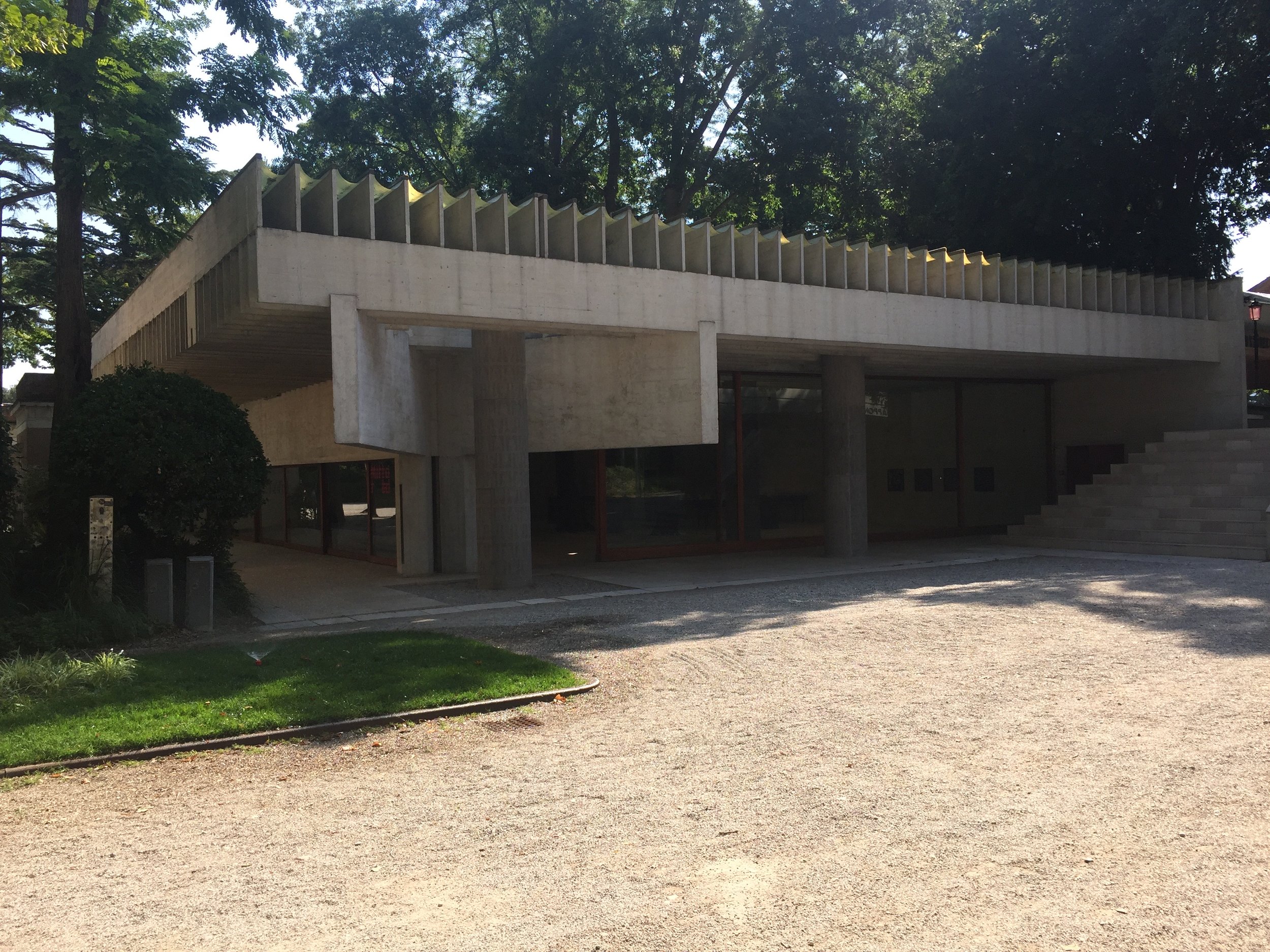
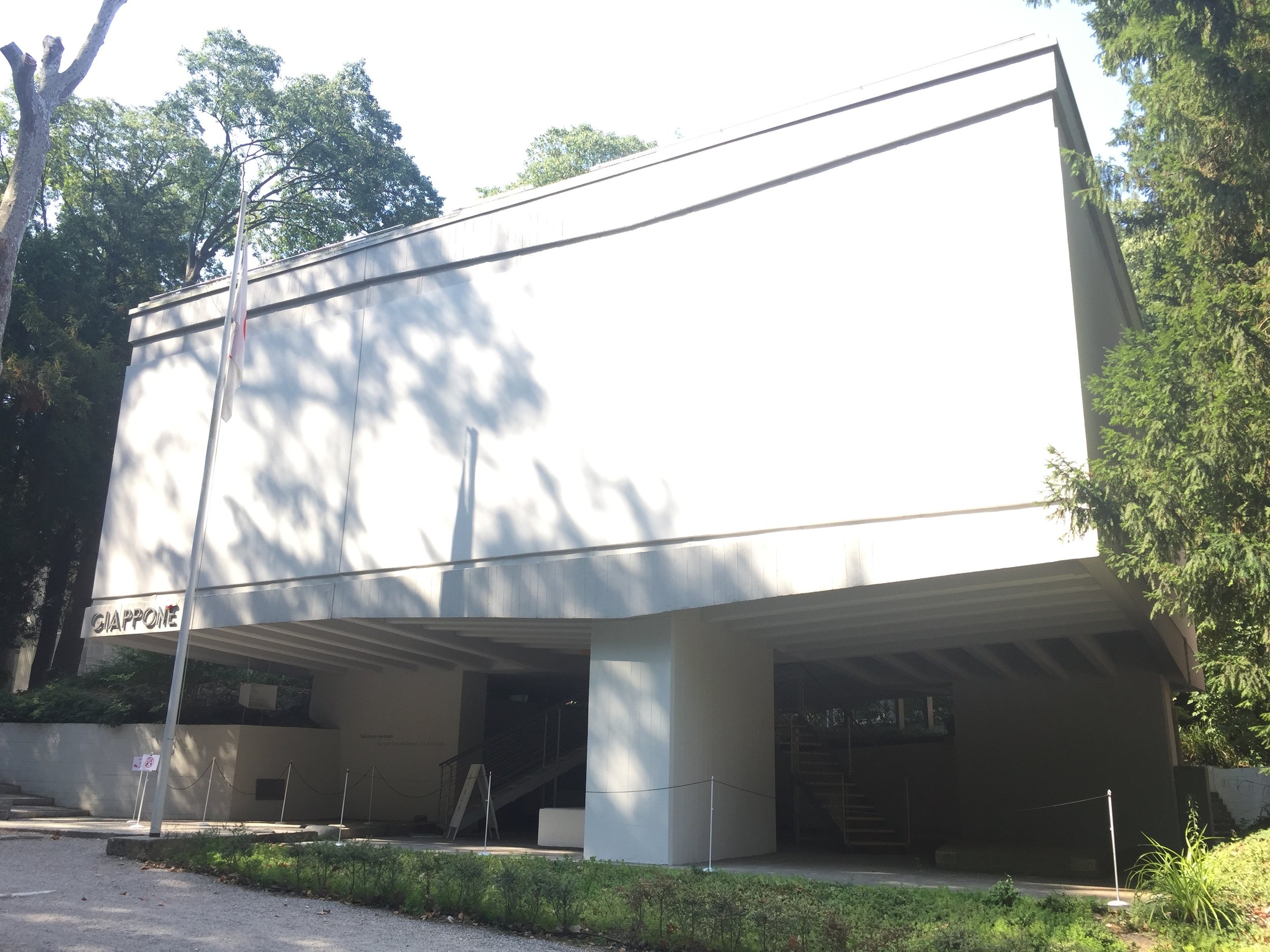
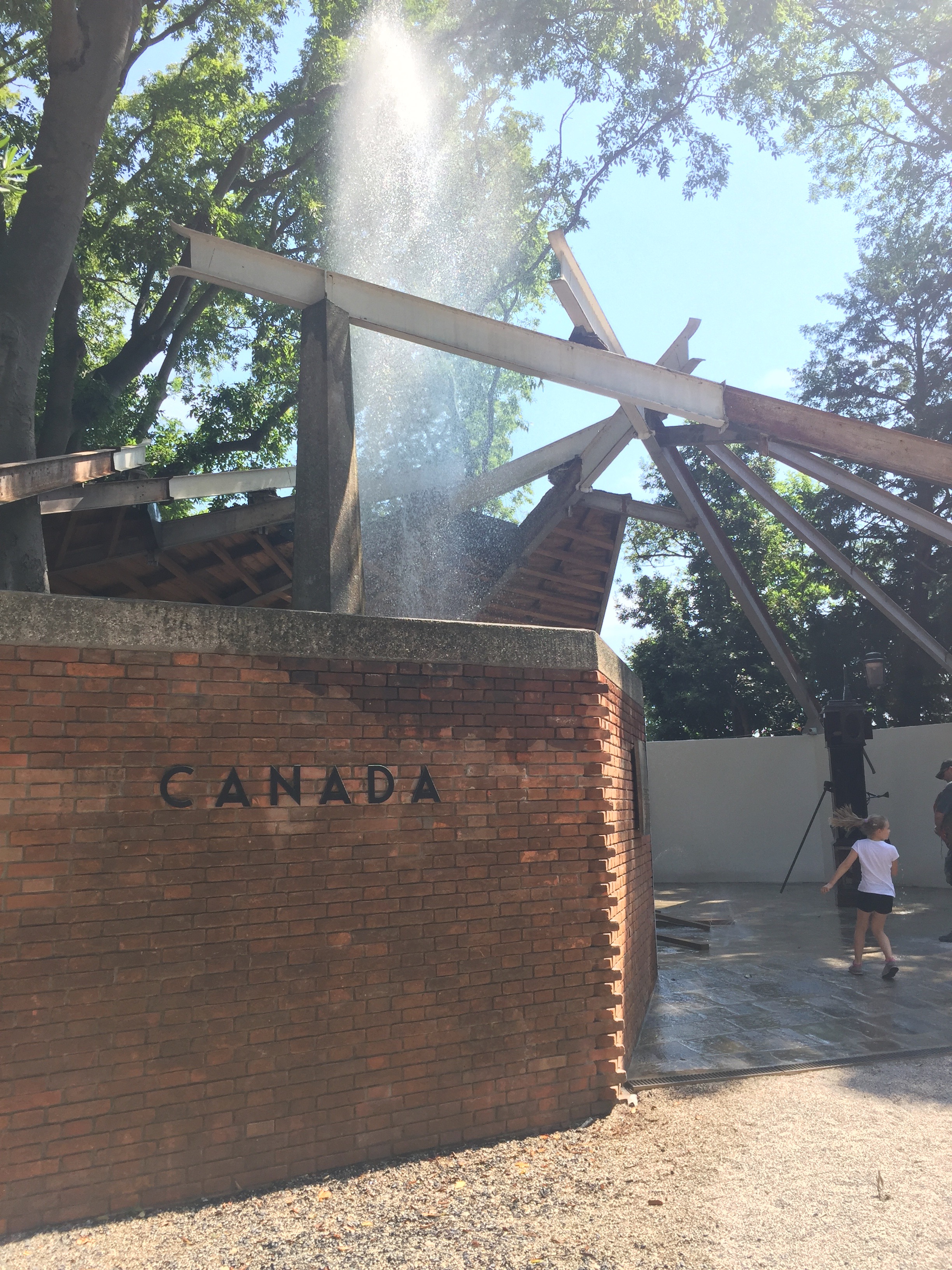
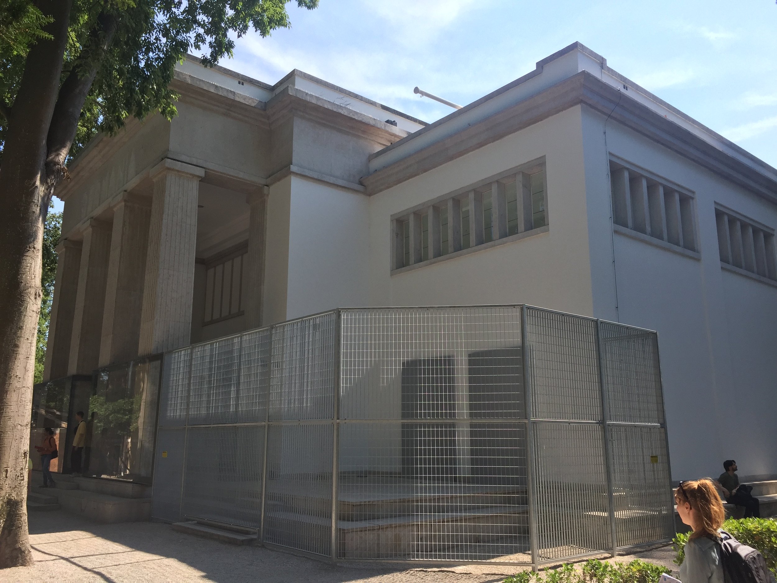
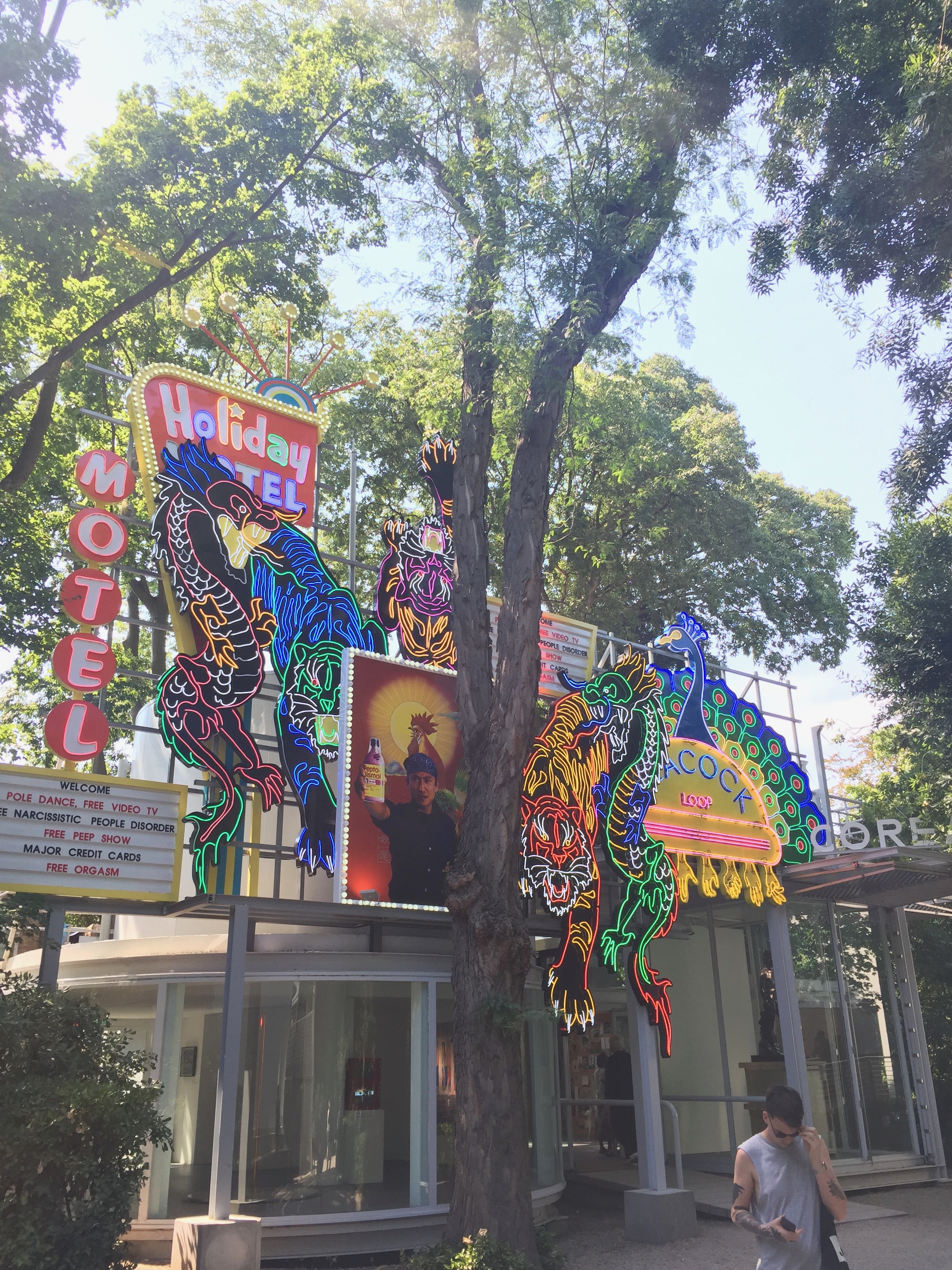
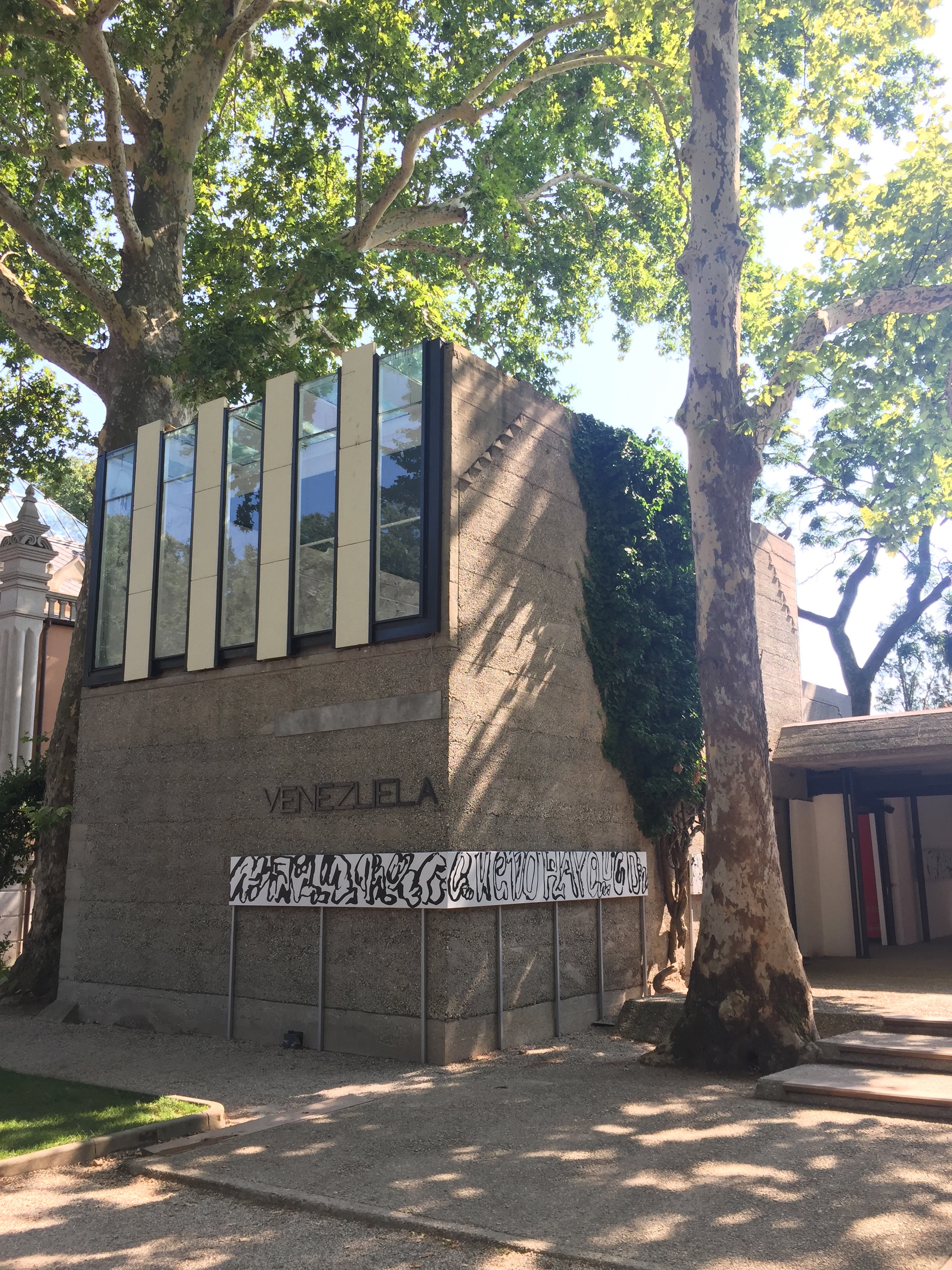
This Pavilion site takes a whole day to get around in the Venetian heat with food & drink breaks included. Here each country has its own purpose built permanent gallery in the park grounds. There is a story to be told from the architecture & placement of each gallery as every country has a building that seems to represent what a gallery should look like according to those countries at the time it was built. Some galleries are built in a neo-classical or modernist style, others have ornate brick & wood work & there are even super modern designs. All of the architecture styles taking on different eras depending on when they were added to the site. Canada seem to have removed their building in order to install the fountain exhibit. One of the newest additions seems to be that of South Korea which is a steel & class box
Austria
To begin this post we are taken to Austria with the exhibition, 'Just about virtues and vices in general' by Erwin Wurm. A selection of his one minute sculptures are in the gallery & visitors are encouraged to follow the instructions & interact with the work. From the outset it looked bold & fun, after some exploration it proved to be that & more. Outside the gallery is the first work where a truck is positioned bumper first into the ground with its tailgate high in the air. Viewers are ushered up a set of stairs at the back & can climb through the truck to the top. It offers a refreshing perspective of the area plus a strange experience.
Erwin Wurm, Stand quiet and look out over the Mediterranean sea, 2016/17. Outside Austrian Gallery.
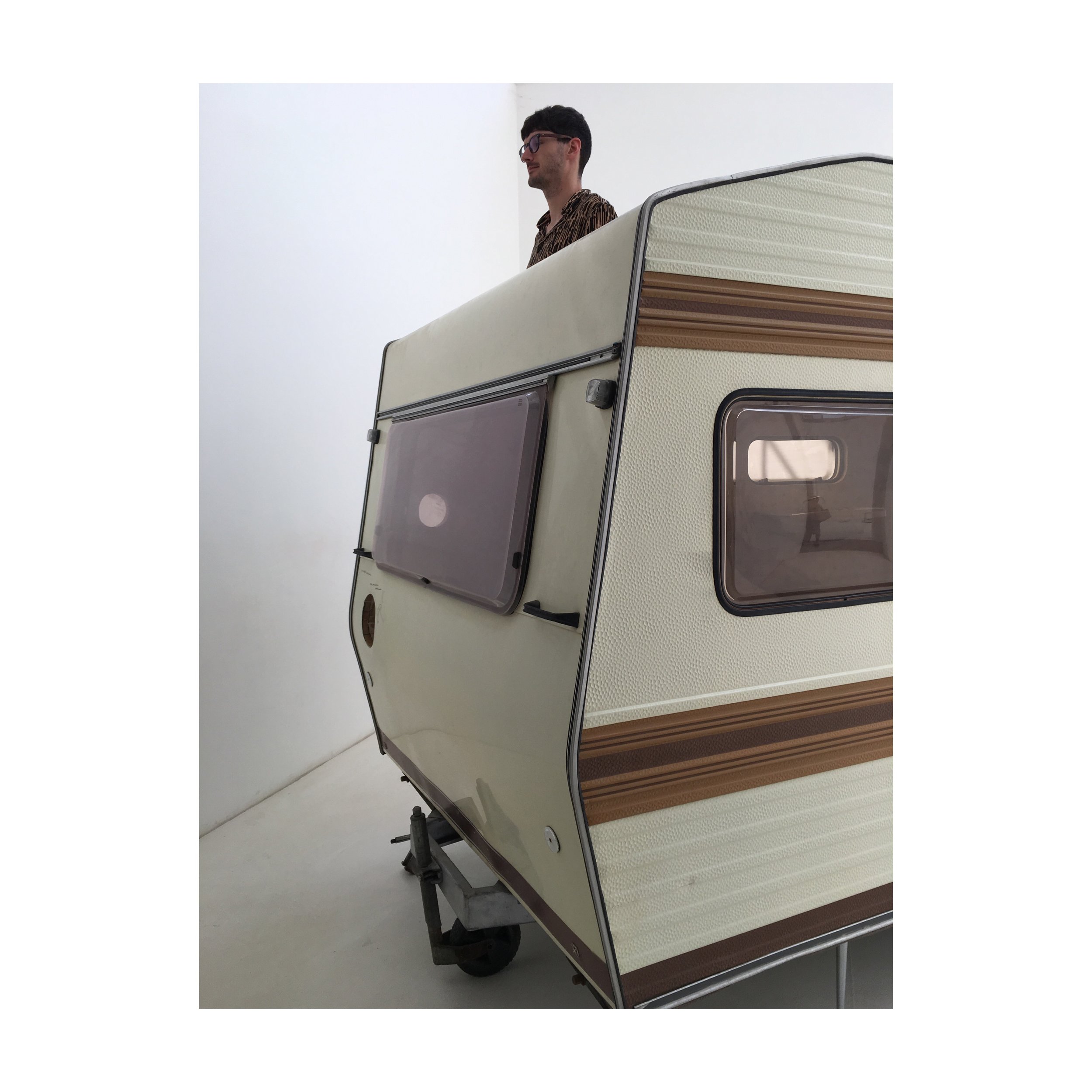
Inside the gallery the fun continues as interactions with the work carries on. In one room there is a caravan with a chair attached to the side & several holes in its walls. Next to each cut out, a pencil drawn diagrams shows us how to interact with work. Next to one hole there is a drawing of a person putting their head through it. Another hole has hands going through. The caravan offered many one minute moments. These interactions allow us to behave in a way that is scarcely encouraged in exhibitions, more often there are guards, alarms & ropes to stop us touching or feeling work. This allowed our explorative instincts to take over & our sense of touch as well as experience to be indulged.
In addition to the large caravan there were more smaller one minute sculptures that could be stood on or sat on. One scenario has the viewers place their head on a plinth as though they were the art, while from above they are being slowly roasted by a lamp shade hanging close to their head. This work has taller viewers buckled at the knees as they squeeze into the gap to rest for a minute. Wurm's work turns the gallery into a playground where viewers can become part of the work instead of being there to look at suff on walls. Watching the interactions is amusing too as everyone takes a slightly different approach. We are encouraged to experience art with touch which is not normally on the list of allowable activities in galleries. It is refreshing & fun, in addition to being relatable. All of the sculptural objects are things we would normally interact with in life outside of galleries, hinting towards readymade art.
Erwin Wurm, Just about virtues and vices in general, 2016/17
Nordic Pavilion
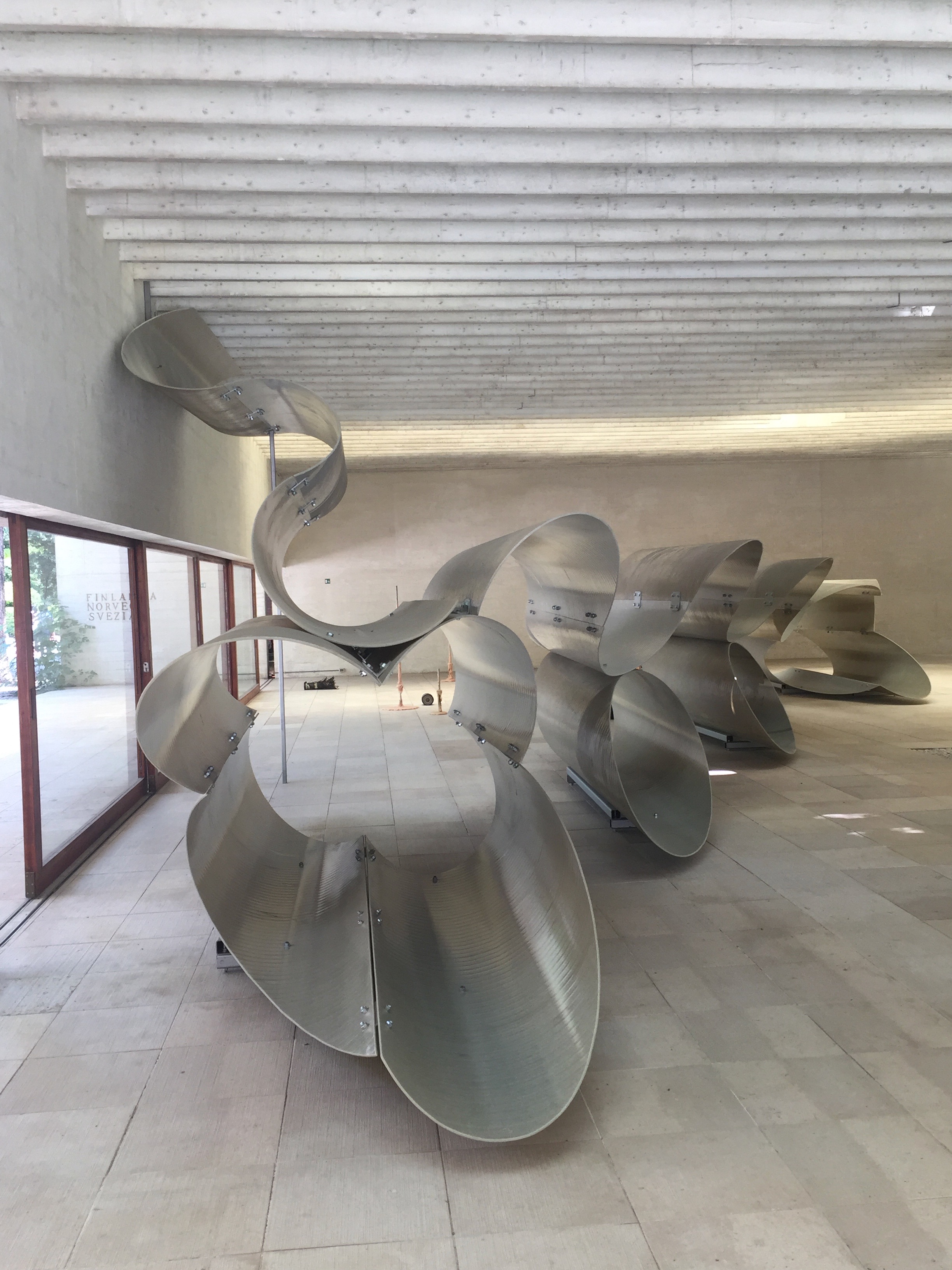
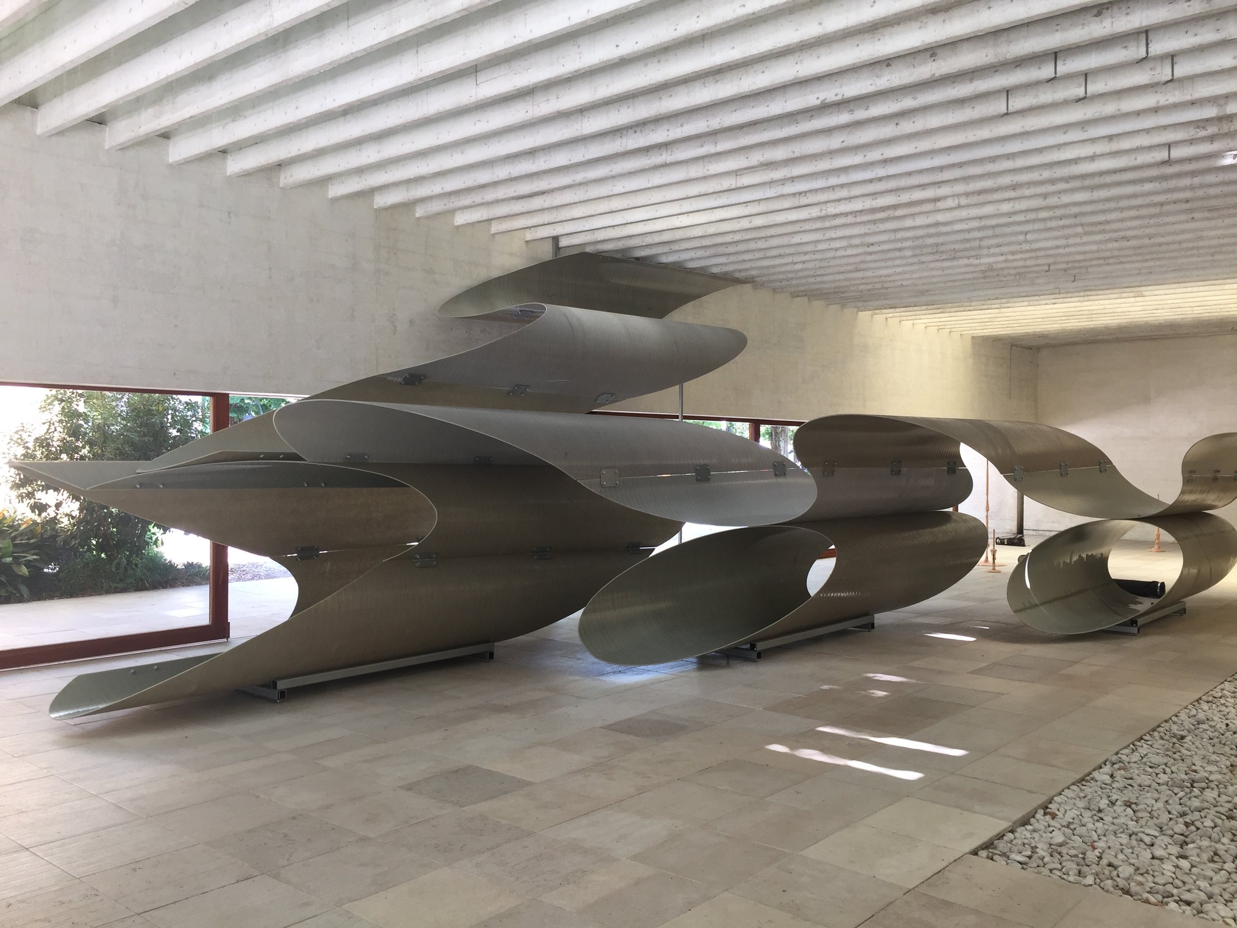
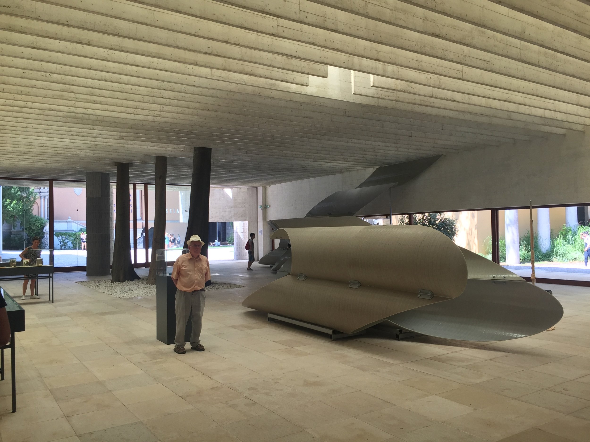
This space is shared by 6 artists in a show called 'Mirrored'. The largest of the works & my top pick of this exhibition is Siri Aurdal's 'Onda Volante' (Flying Wave), 2017. Her sculpture is a sprawling sequence of cut fiberglass reinforced polyester tubes that fills the space closest to the windows. Aurdal now almost 80 has made an ultra contemporary work using an unusual art material that might be more associated with manufacturing. With this the work is incredibly fluid. Her work is held in the space so wonderfully & uses architectural elements to enhance it. 'Flying Waves' fills the length of the gallery & the light from the windows plus from above allows the work to shimmer & shine. Part of the wave is high in the space & it descends down from the ceiling onto the floor, then continues across the floor space. The arches in the work allow for the viewers to pass through it offering shaded views of the inside. Glimpses through the sections allow fragmented views of the rest of the space, new shapes are revealed, light & dark play with the spaces. This work uses its material to the limit & is minimalist. One form carries the entire crispness of the work. Although this work sits in the space, dividing it up, its visual impact is not disruptive or aggressive. The wave offers a graphic experience into the flow of space & although this is a large work, from some perspectives it shrinks to a few small planes.
Gran Bretagna
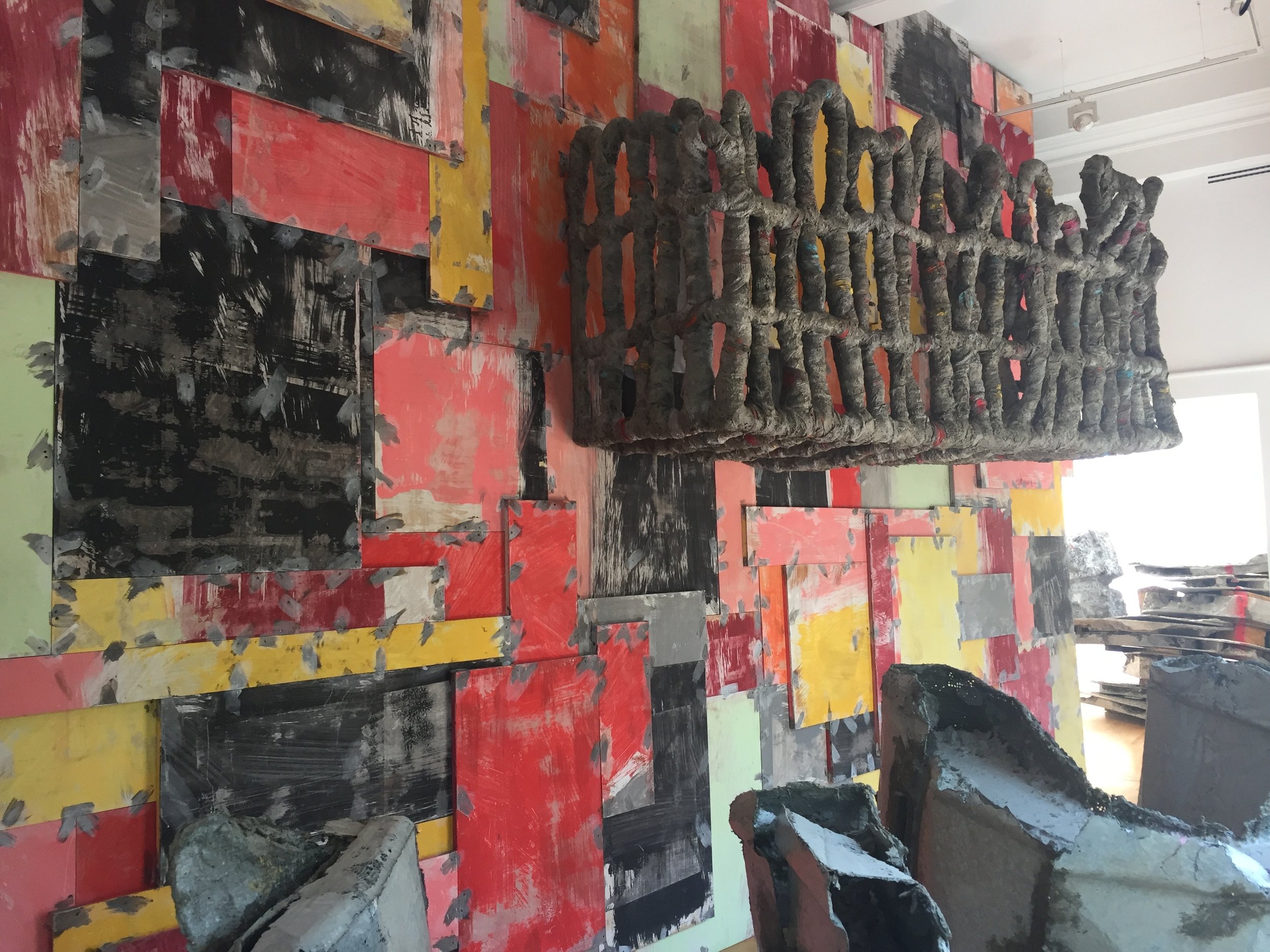
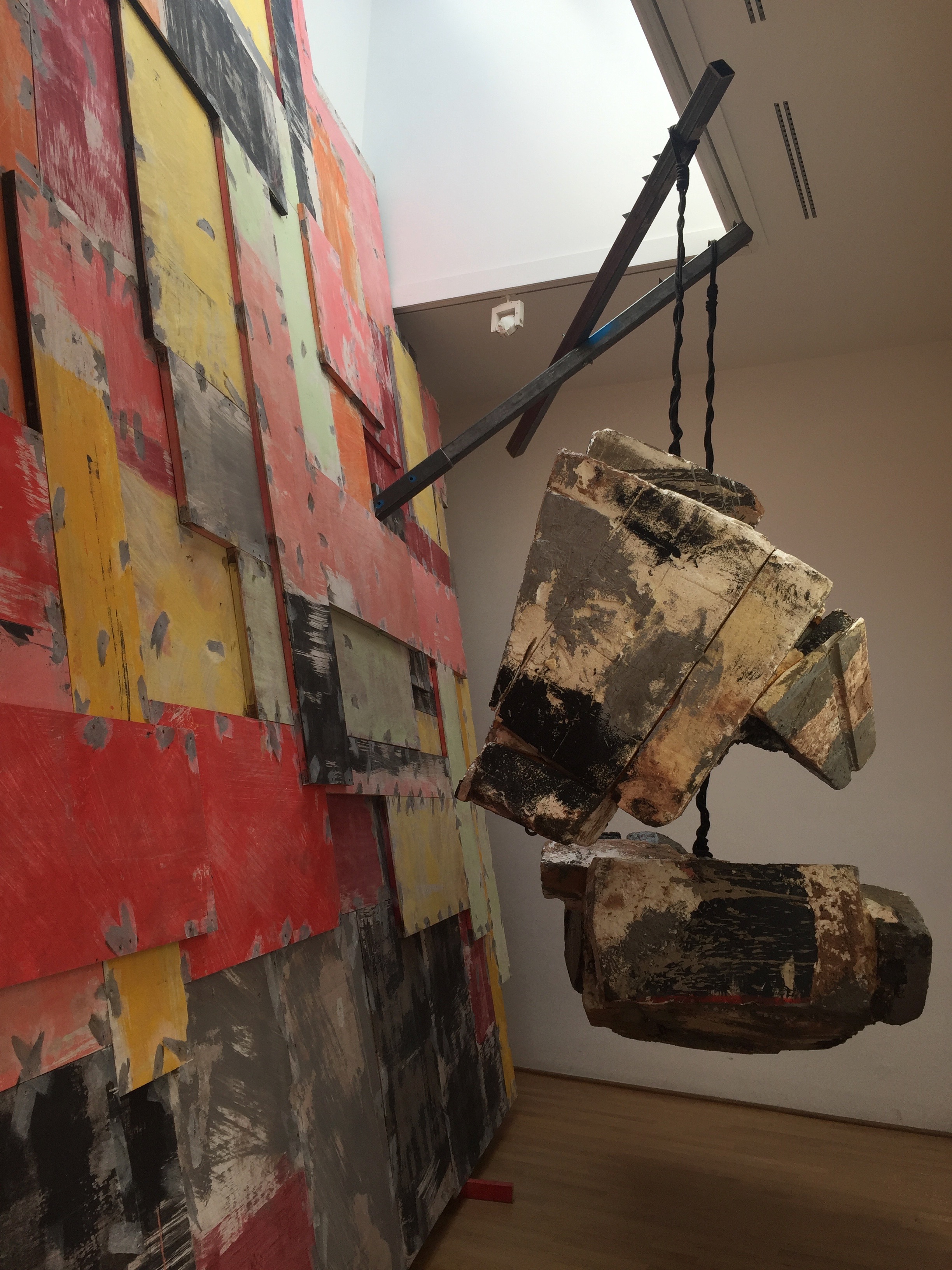
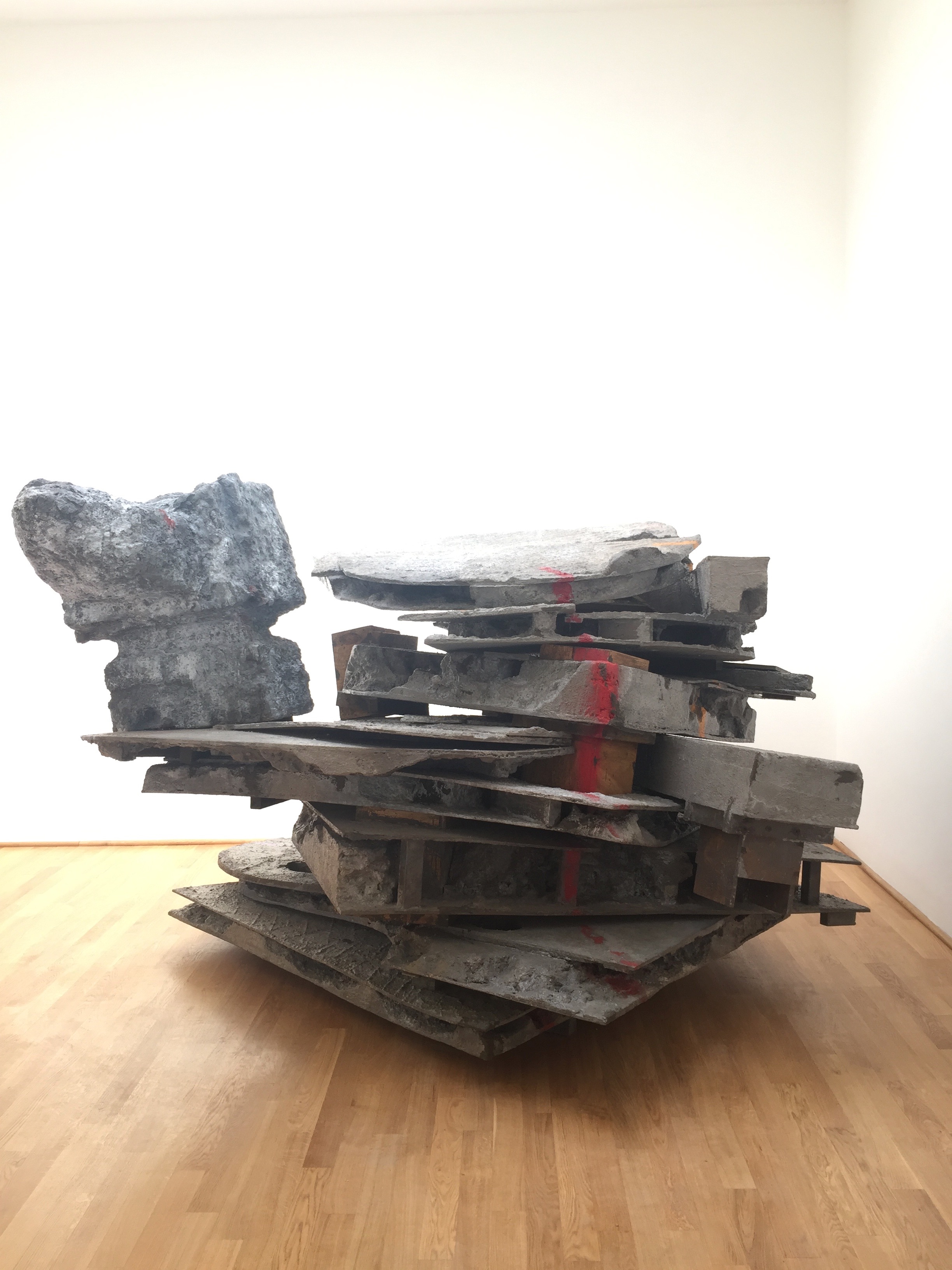
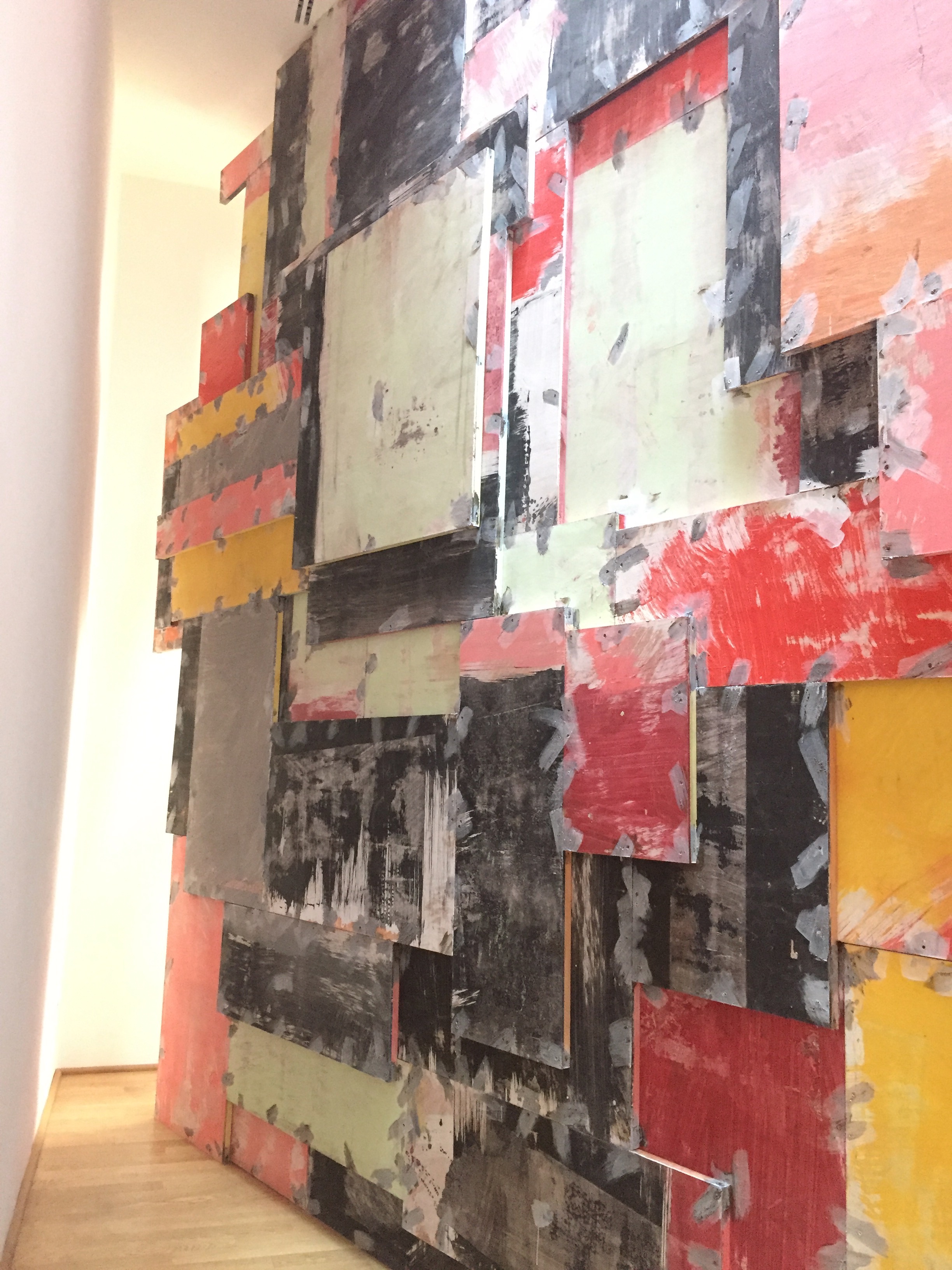
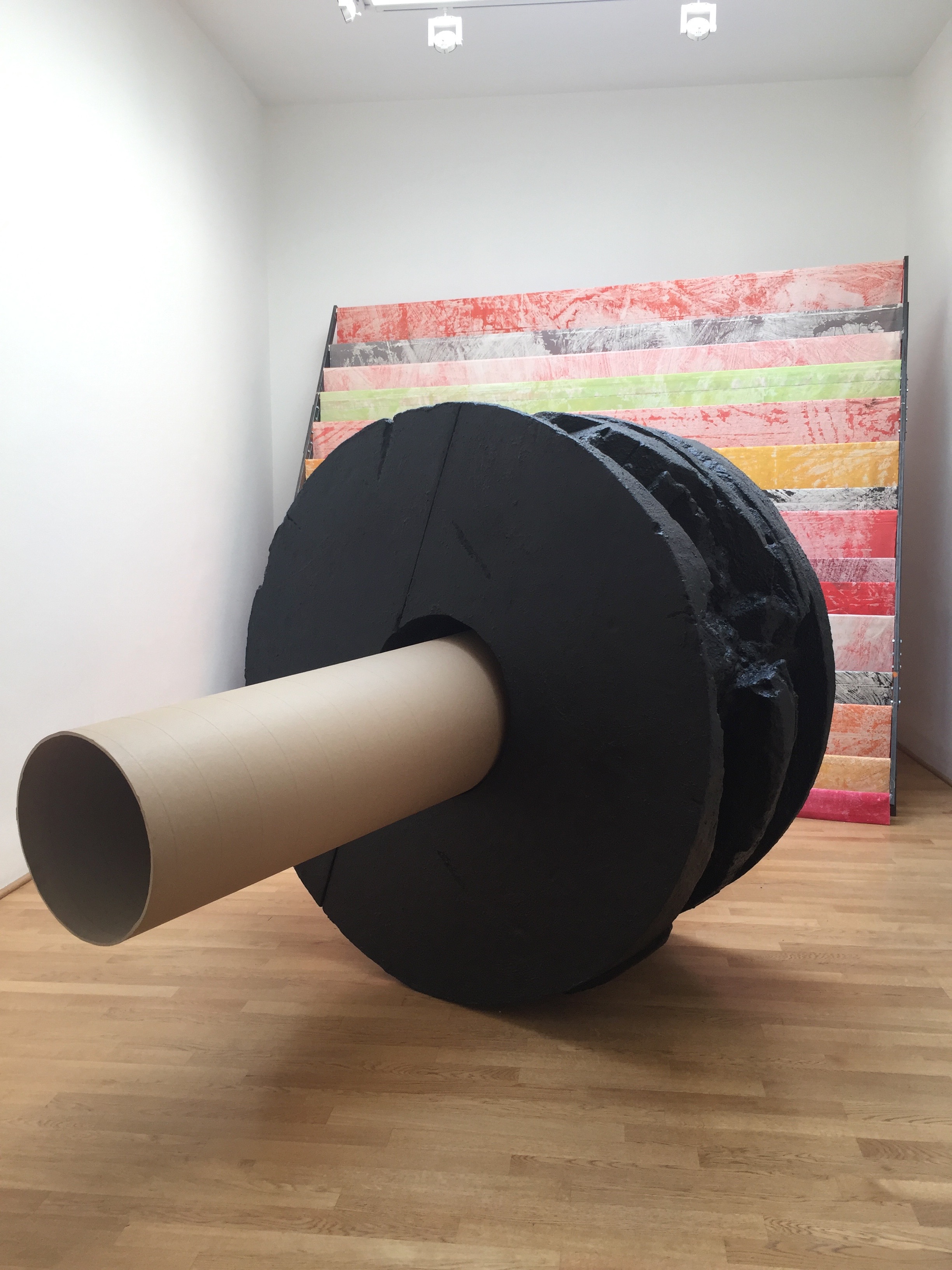
Phyllidia Barlow 'folly' is this years work for Great Britain & normally I wouldn't be excited about a work like this, its not a style that I particularly enjoy. However at the Venice Biennale it is possible to be swept away in all of the creativity & really immerse yourself in total form & visual language. Here I was beguiled by the scale of the work & its complete take over of a gallery. 'folly' is fun, bold & large. All of the sculptures fill the spaces in the gallery, bisecting rooms or reaching high into the space. It is possible to really explore, looking into tight dark spaces behind massive planes or up to ledges that jut out on their way up to the roof.
I think the element of this work that creates a jar with me is the application of colour & the finish of the material. Some parts of the construction look like papier mache which has tough job to look sturdy or weighted in this exhibition. Also some of the colour application is a scribble, making the work look unfinished or rushed or "that'll do-ish". There is a whole valid style of painting & making art in this style at the moment, it seems to be in lots of galleries but I just can't get with it. It lacks enough considered information for me & doesn't force home an idea other than it seeming like the artist is saying "I'll slap this colour here". A word that comes to mind is Wallpaper. But as I said there are only some point here where it falls slightly short.
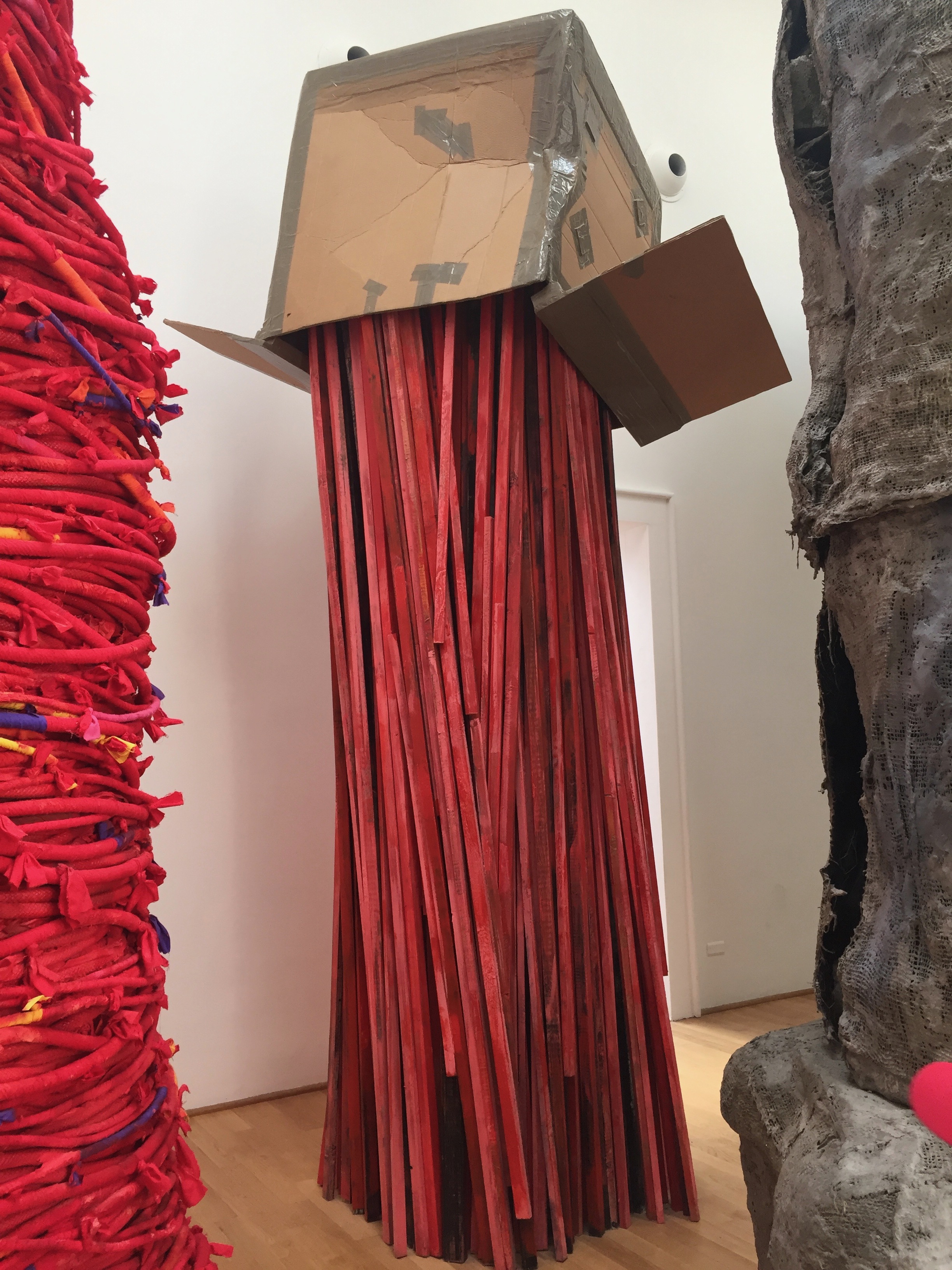
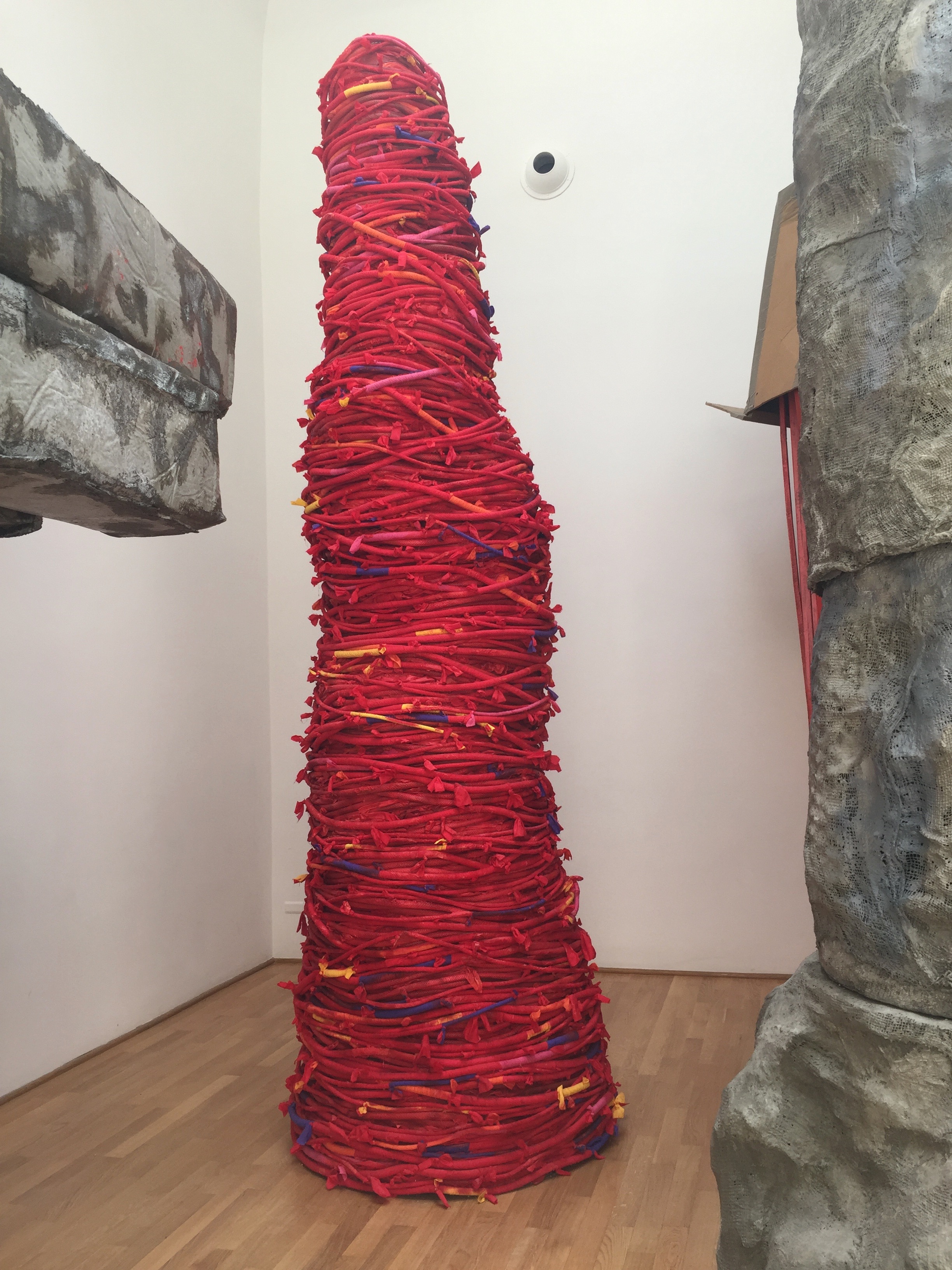
There are some wonderful moments here that have great scale & material choice. They have a quality that is exciting & sets them apart as sculpture. They steer away from a theme park set feeling that some of the other work edges towards & have a sense of humour, scale & texture. One particular large work made of long red stems holds up a large cardboard box, this has fantastic presence in the space. It is bold, bright & simple. This work sits in with a few other large scale objects in the galleries that offer something extra, something tangible that speaks out above the rest. These works stand out & the other constructions provide the landscape to allow them to steal the show.
Espana
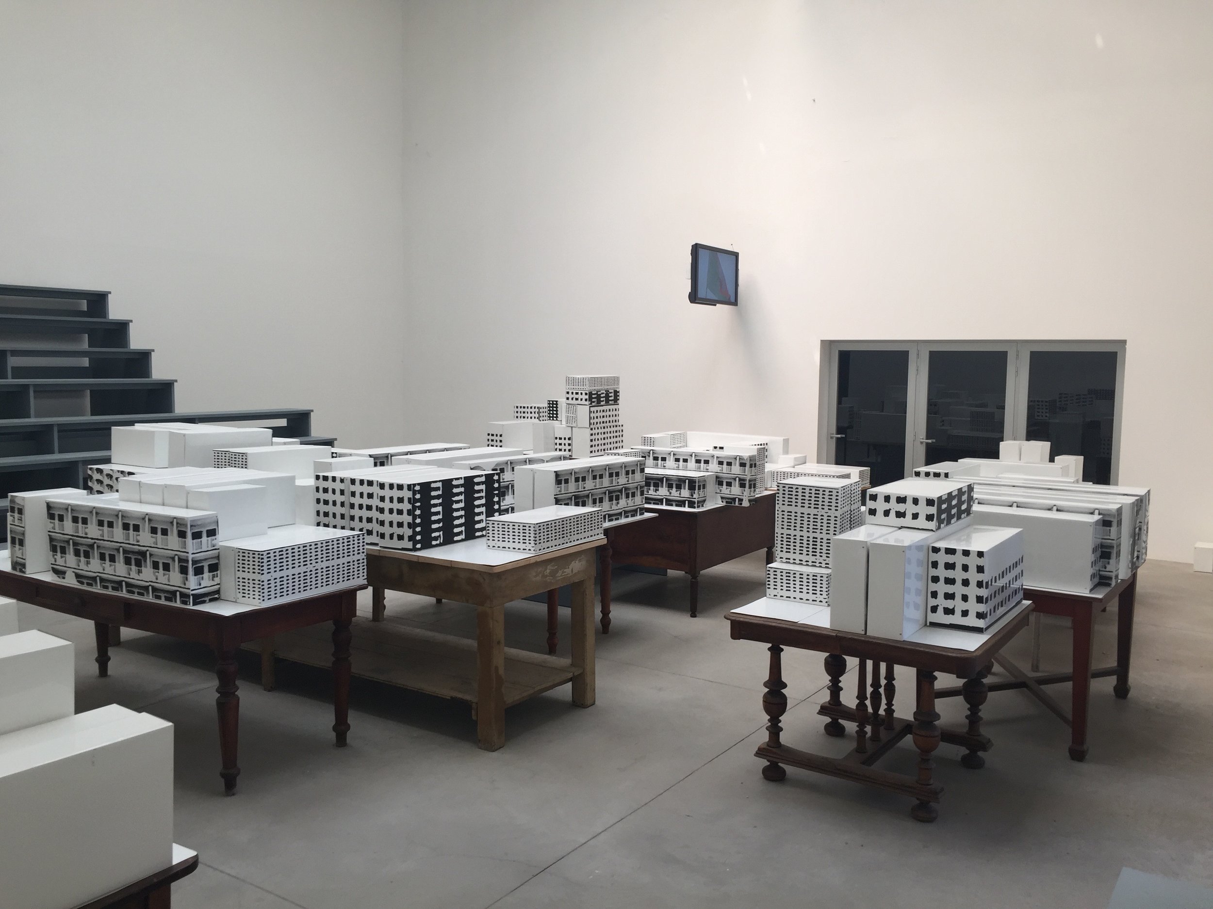
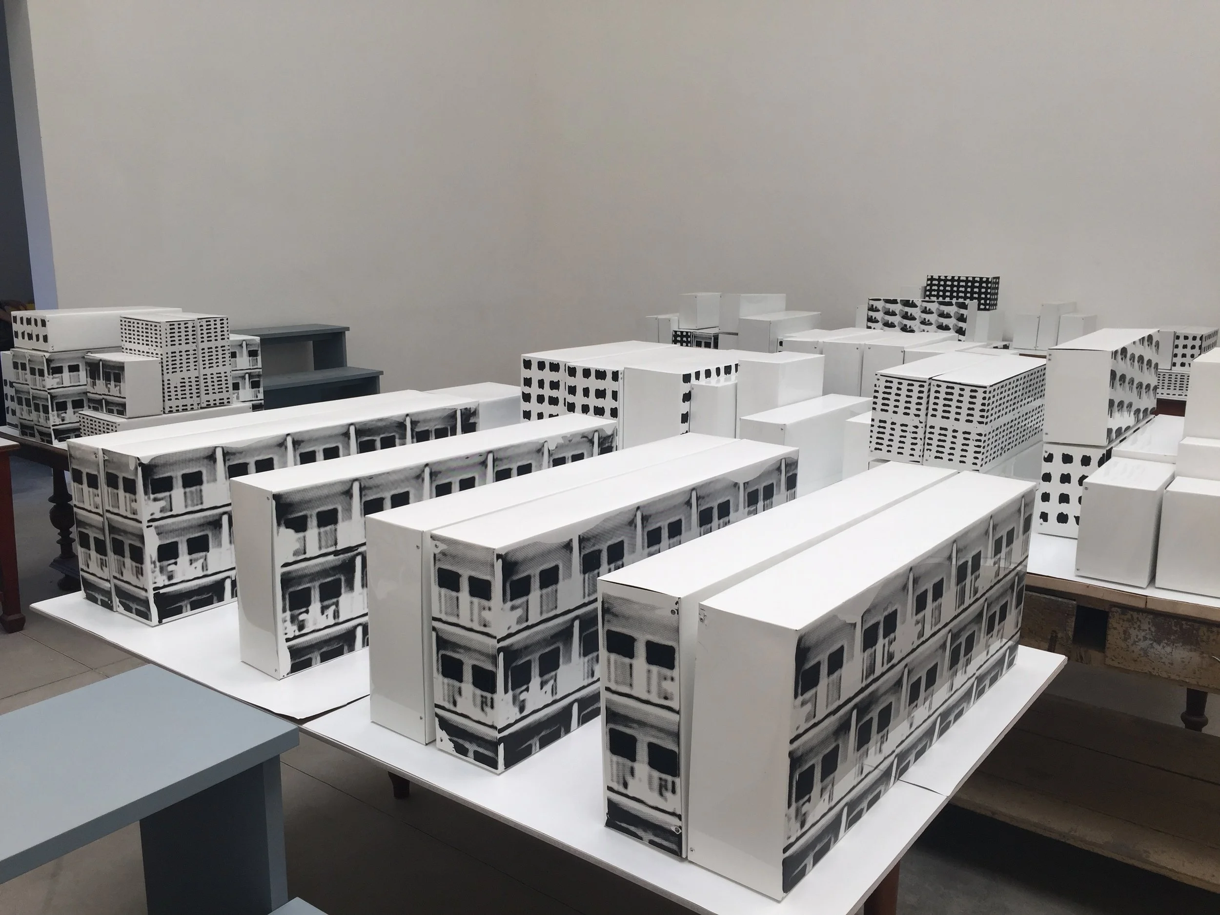
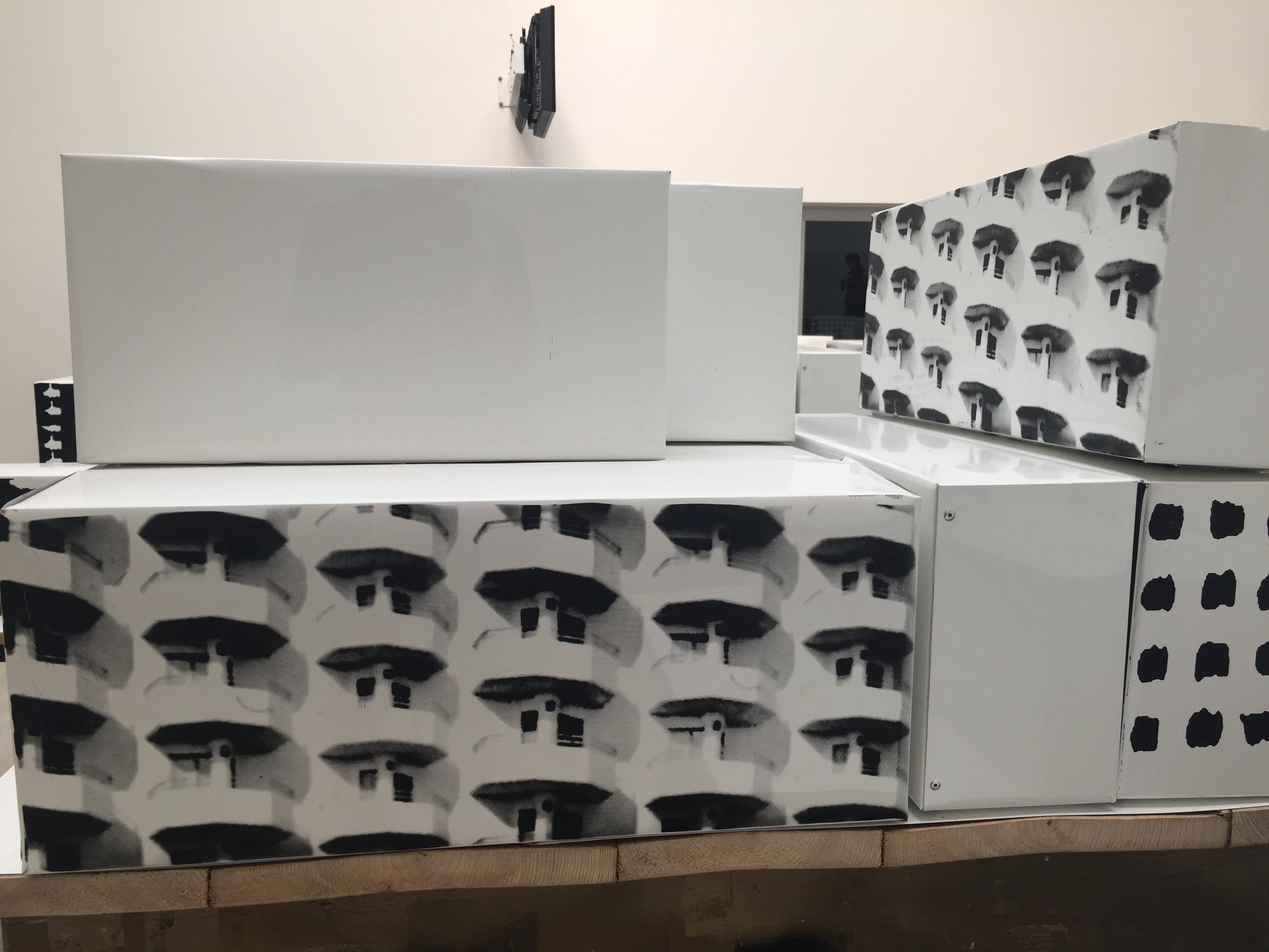
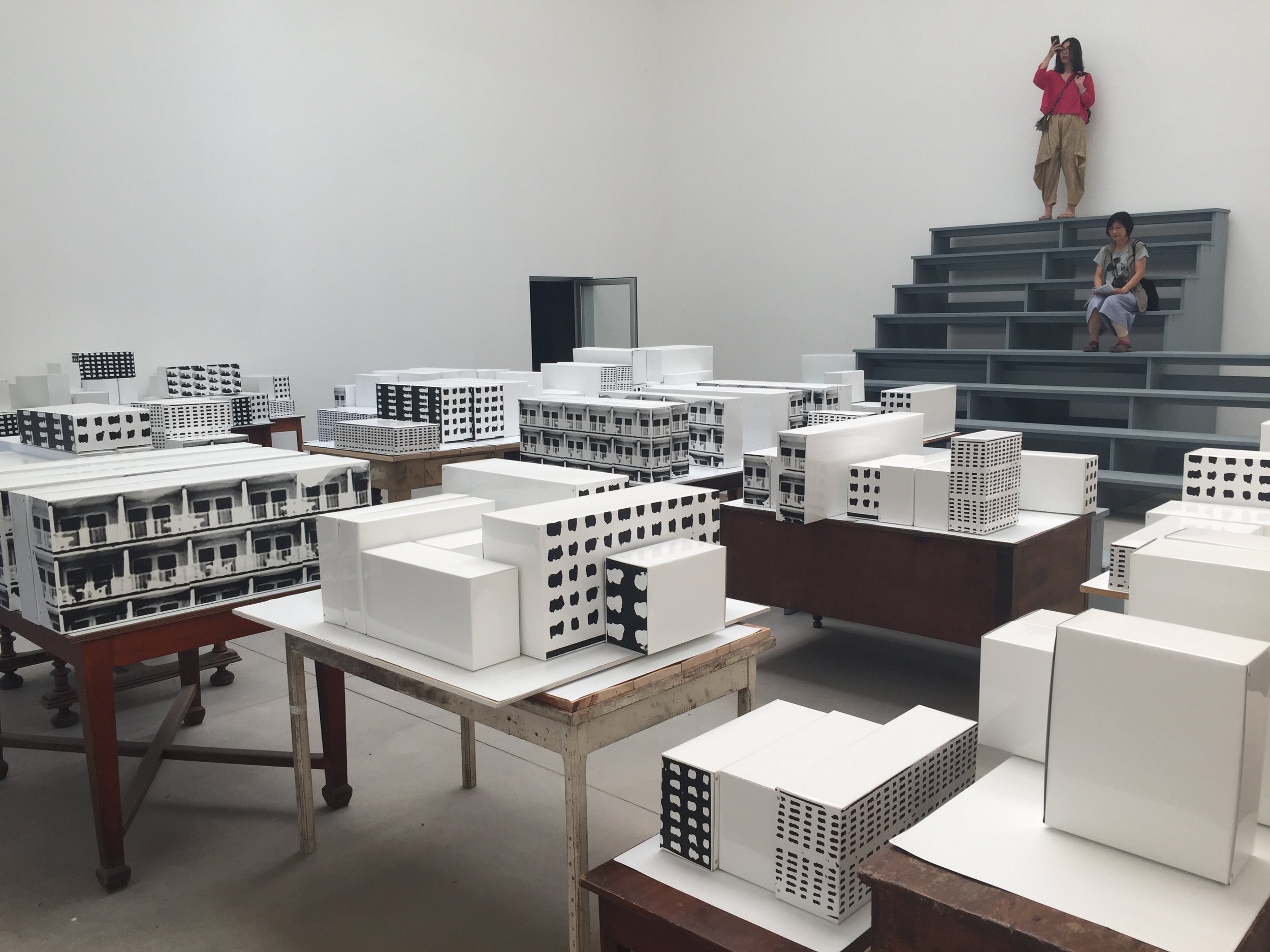
We have made it to the work that has spoken to me the most. It contains a few ideas that I have been developing over the last year & there is an immediate affinity with my own practice. From the outside, looking into the gallery, architectural shapes form a scape that invites you in. Artist Jordi Colomer presents '!Unete! (Join us!)' which looks at Nomadism as a form of citizenry. One of the visual elements used is architectural landscapes comprised of printed architectural features, such as window or balconies, on white metal boxes. They are placed on wooden tables & clustered throughout the gallery. They come together forming miniature street blocks in a city that viewers can wander through. There are also grandstands constructed in the spaces throughout the pavilion so that it is possible to climb them & view the room & work from above. This element of the work suggest that we are there to witness a plan, to cast our opinion on the mock up of a new idea. Some blocks are laid out like rows of tower blocks, others are stacked up with different patterns like shanty towns & one area seems to contain the balconies one would associate with mass hotels on Spanish sea resorts. One table is even reminiscent of Corbusier's plans for new architecture.
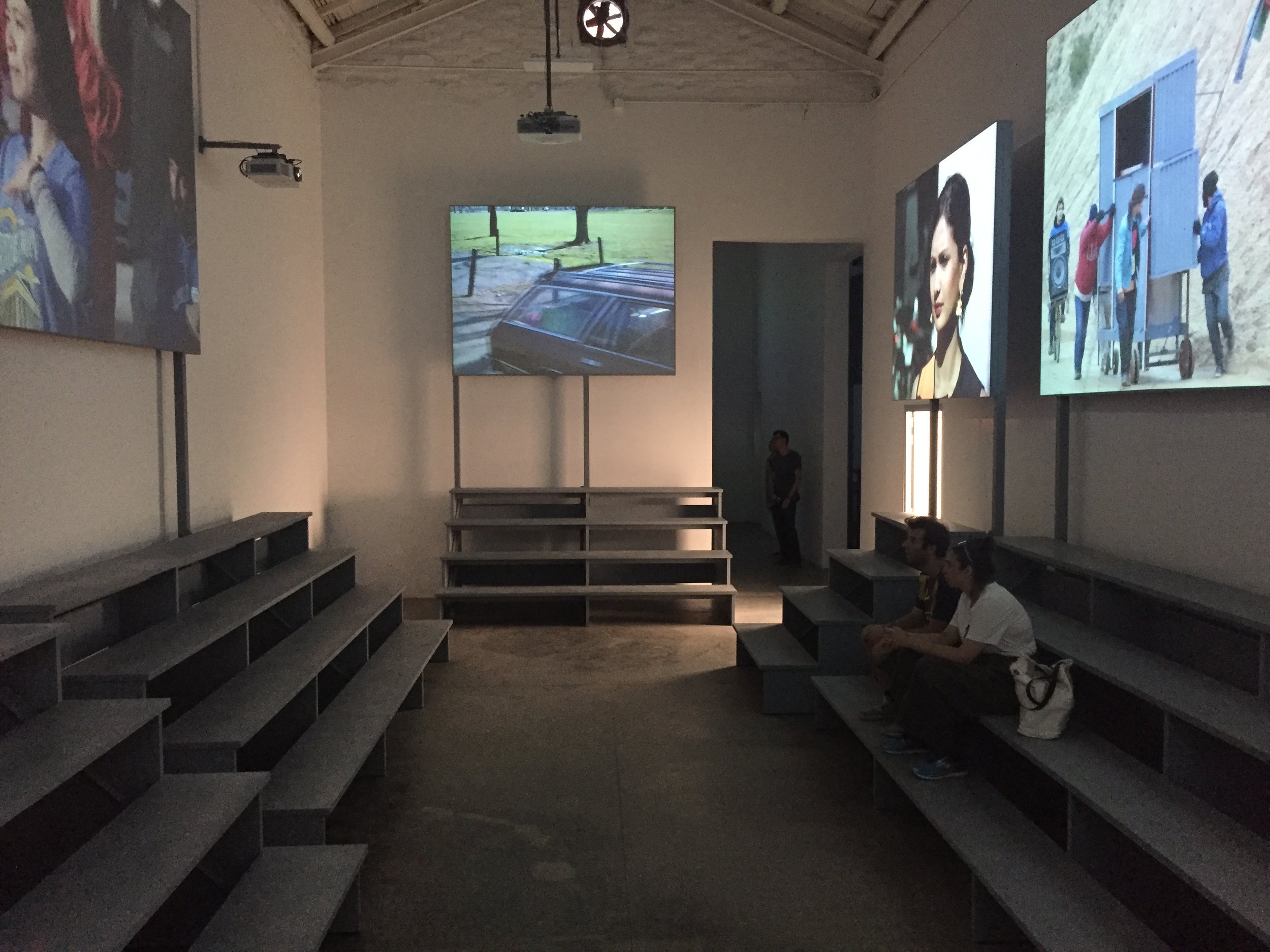
This exhibition also contains films which can be viewed from the various grandstands. One screen shows a flat filmset building being wheeled across a lot - movable architecture. Another is of a car driving through a city while someone uses a mega phone to shout out messages.
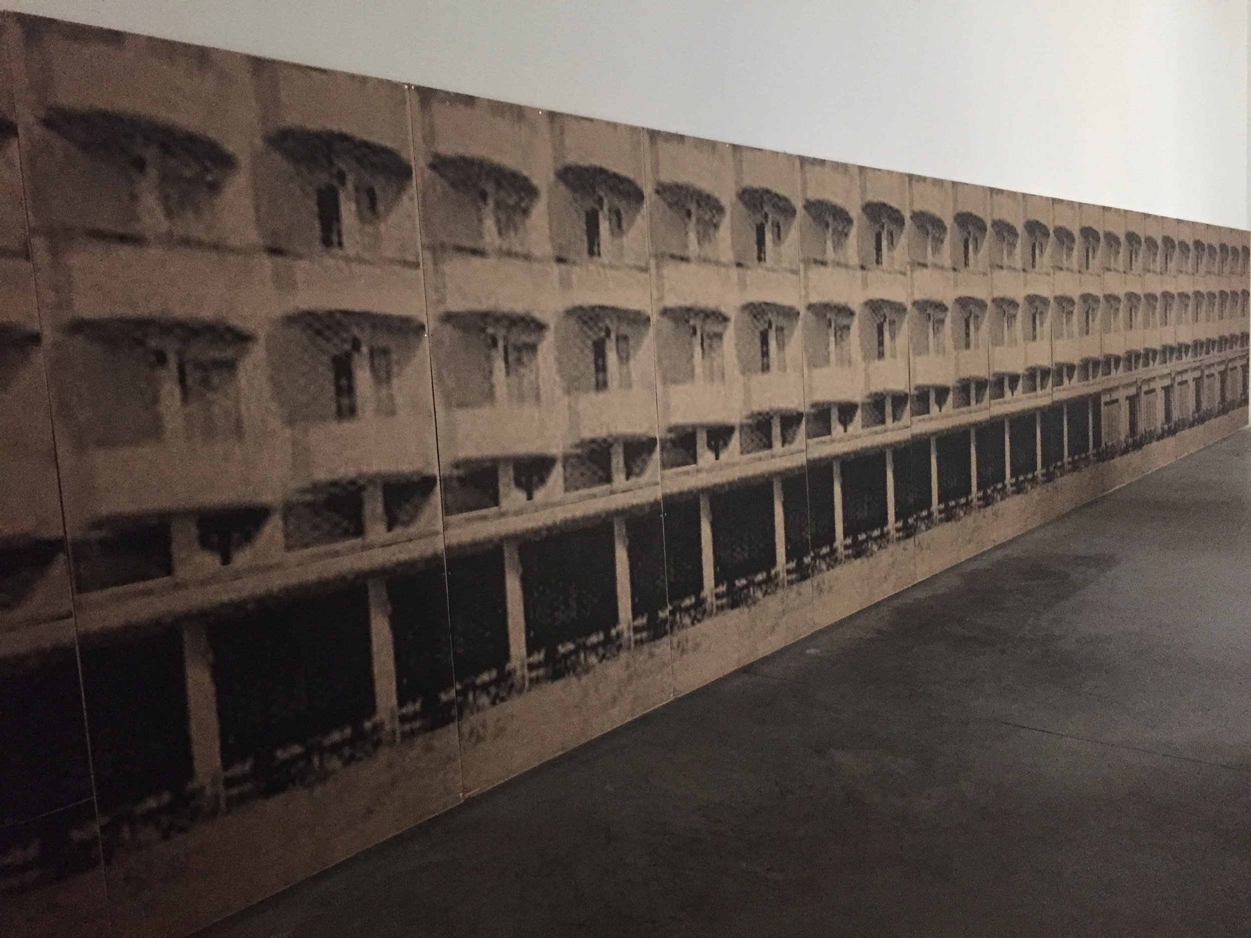
One element of Colomer's work that adds more context to my own practice is part of one gallery that contains a whole wall of architectural print, screen printed on cardboard. In this case the card is used as cladding for the space rather than providing volume in the space such as my own recent work.
This work shows a high standard of production. It uses architectural principals to bring a dynamic, enveloping viewing experience. The viewers are projected to new levels of viewing by use of platforms that provide physical height in the space. These structures act as seating so that viewers might be encouraged to stay, rest & take in the work.
All of the work at the Biennale is enriching to some degree but some exhibits just reach out & stir your creativity. I have been galvanised to develop further what I do, to bring in new elements that can add a richness, developing my work aesthetic further. Research will also play a big role going forward as the work will be contextualised further. All of this is informed by going to see art, learning what is possible & what the future goals can be.
